“100 Days of AV Cart Art”
Every day for a hundred days I will be documenting an audio and/or visual installation on an AV cart like the one below. This project also can be followed on Instagram @ivymeadows
Every day for a hundred days I will be documenting an audio and/or visual installation on an AV cart like the one below. This project also can be followed on Instagram @ivymeadows

Final project : Sky Box

FINAL PROPOSAL
My final project proposal was for a public light therapy room called Sky Box, taken from the place where you manipulate lighting in the 3D gaming program Unity, which is called Skybox, and also as a reference to James Turrell’s Skyspace series.
The installation would be installed temporarily outdoors in public during the winter.
Inside it would be heated and artificially lit with bulbs that change color along the pattern of a long summer day from sunrise to sunset, which would not match the real exterior of what is currently going on in the sky.
In the center, a real tree is planted, nurtured by the heat and light.
In the morning the Sky Box would turn a full, rich blue, and at sunset, a full, rich red, and a spectrum of the two in between. This highlights the color spectrum of blue and red, which we vacillate between every day.
REFLECTION
(Note: A reflection on my research and interviews can be found here.)
After our critique, I am now thinking that this could also potentially be a smaller scale installation that the viewer would view from the outside or through sticking their head inside it from below, or potentially with projections in an indoor gallery space. I am imagining something like the Tiffany windows displays on Fifth Avenue meets a peep show, but light (and possibly sound) therapy-themed. It also became clear that not everyone would want to be in such a space; it needs more to draw people in. I was thinking sound may be it, but am open to other avenues. Something as simple as good seating could be enough, or a place to plug in your phone or watch short videos, and/or view more miniature installations inside.
In the end, I feel that the project became a commentary on lighting in real versus artificial spaces, as well as hopefully an inviting public space, all conceptual meanings aside. The ultimate aim in the end was to create a respite from the cold and dark and a place that people would want to visit to recharge. Through my experimentation, research and interviews in making the project I found that something too critical did not seem fitting in the end; making a sensory experience based on the research seemed to make more sense for me.
A further iteration of this piece would also possibly include sound, which could be manipulated either by people in the space or by other data. I am still not sure what data would make most sense or add to this project though — perhaps the location of the Sun either in real time, or in the artificial space’s time.
Over the course of this project it also became apparent to me that the Dream House was a big source of influence. The Dream House has a lot of rules and meaning behind its creation, but they are not forced on you when you visit it. In fact, it takes some probing to find out the background of why or how it exists. Still, the visceral reaction to it is still there, mostly to the sound, but also to the sound in relationship to light, and also how the sound changes based on where you are in the room, which creates a greater general awareness.
In retrospect, I was also thinking that ideally the lights would be run by solar energy, as well as the heat. This also ties into my work on the field guide earlier in the semester, and I think having the installation be solar-powered would bring greater meaning to the presence of light and tie it more directly to the sunlight (or lack thereof.)
Clearly, this is all hypothetical. I will be continuing to work on these themes though for thesis. I found it helpful to imagine big or most likely unrealistic first, then will bring it to a smaller scale to try and put it into practice. I also will continue to read the large bibliography I created in this class, as I was only able to get through parts of it for this project, but it will be very helpful for thesis as well and I am grateful to have these resources thanks to our class.
Google Slides presentation:
https://docs.google.com/presentation/d/1BvA-XGk2hS4GIn5ZA3Kgm832FMYI3d0hsKwRtu1SM7s/edit?usp=sharing
Video for Google Lens:
Thanks to Julia Vogl, Graham Coreil-Allen, Eric Rosenthal and Tom Igoe for participating in interviews for this project, and to Marina Zurkow, our classmates and fellow ITP-ers for the helpful advice.
Final project : Color Theremin V2

WHAT IT IS
The Color Theremin is a gesture-controlled musical instrument which plays and manipulates sound samples based on my hand movements, with customizable lights triggered along with the sounds in an accompanying light sculpture.
WHY I MADE IT
I have for many years been interested in the interaction between sound and light. I made this instrument to have a more expressive way to manipulate sounds along with an interactive light component, and to have a new and fun way for me to perform create/record music. I was also inspired by some of the exercises we did in class using granular synthesis and manipulation of samples along the x/y axes.
While I was also thinking the Color Theremin could potentially be a standalone interactive installation, it needs work. I will be continuing to work with different iterations of the project to improve the light/sound interactions.
HOW IT WORKS
The samples are triggered by hand movements on X, Y and Z axes. Moving the hand left <~> right, up <~> down, forward <~> backward triggers the samples and also manipulates the speed and volume at which they are played. The core elements of the setup are Max MSP and MadMapper, as well as addressable LEDs for the light component.
THE CODE
The Color Theremin V2 was programmed entirely using Max MSP for the sound, sending MIDI control changes to MadMapper to trigger the LEDs.
SCREEN CAPTURE/VIDEO
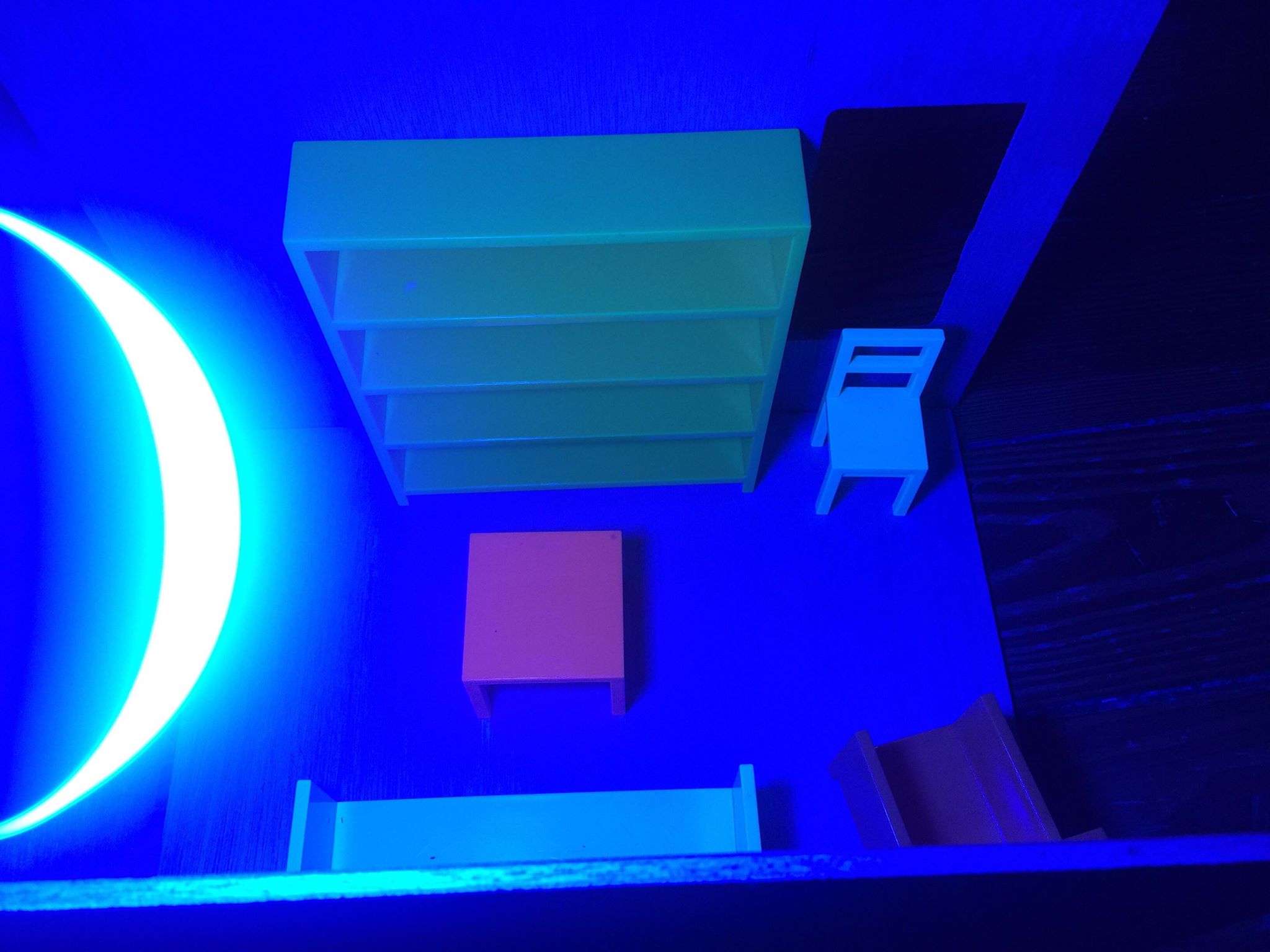
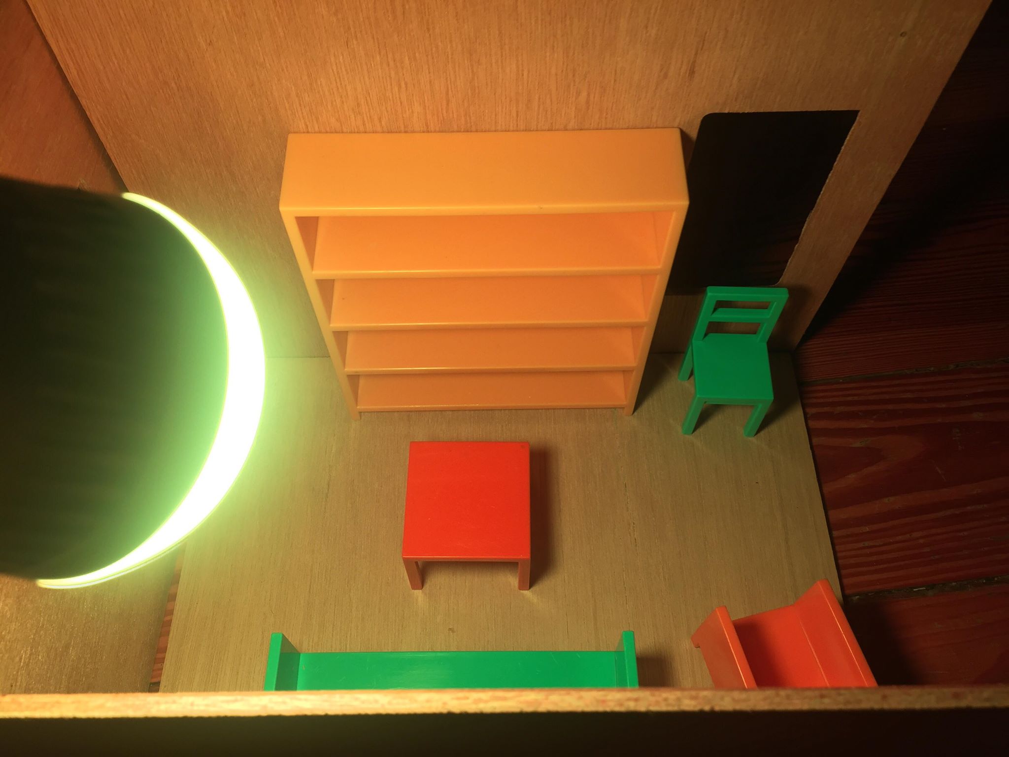
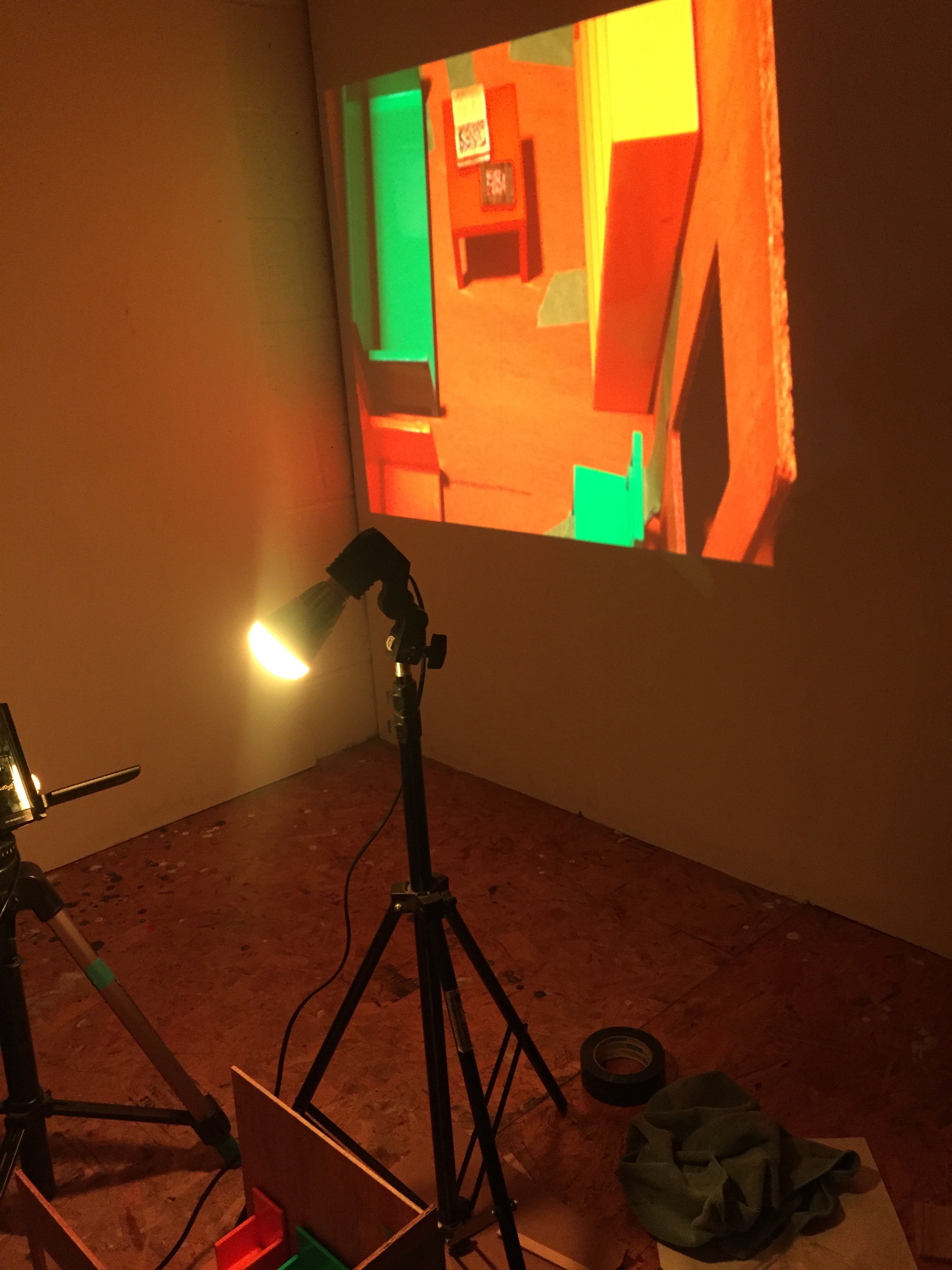
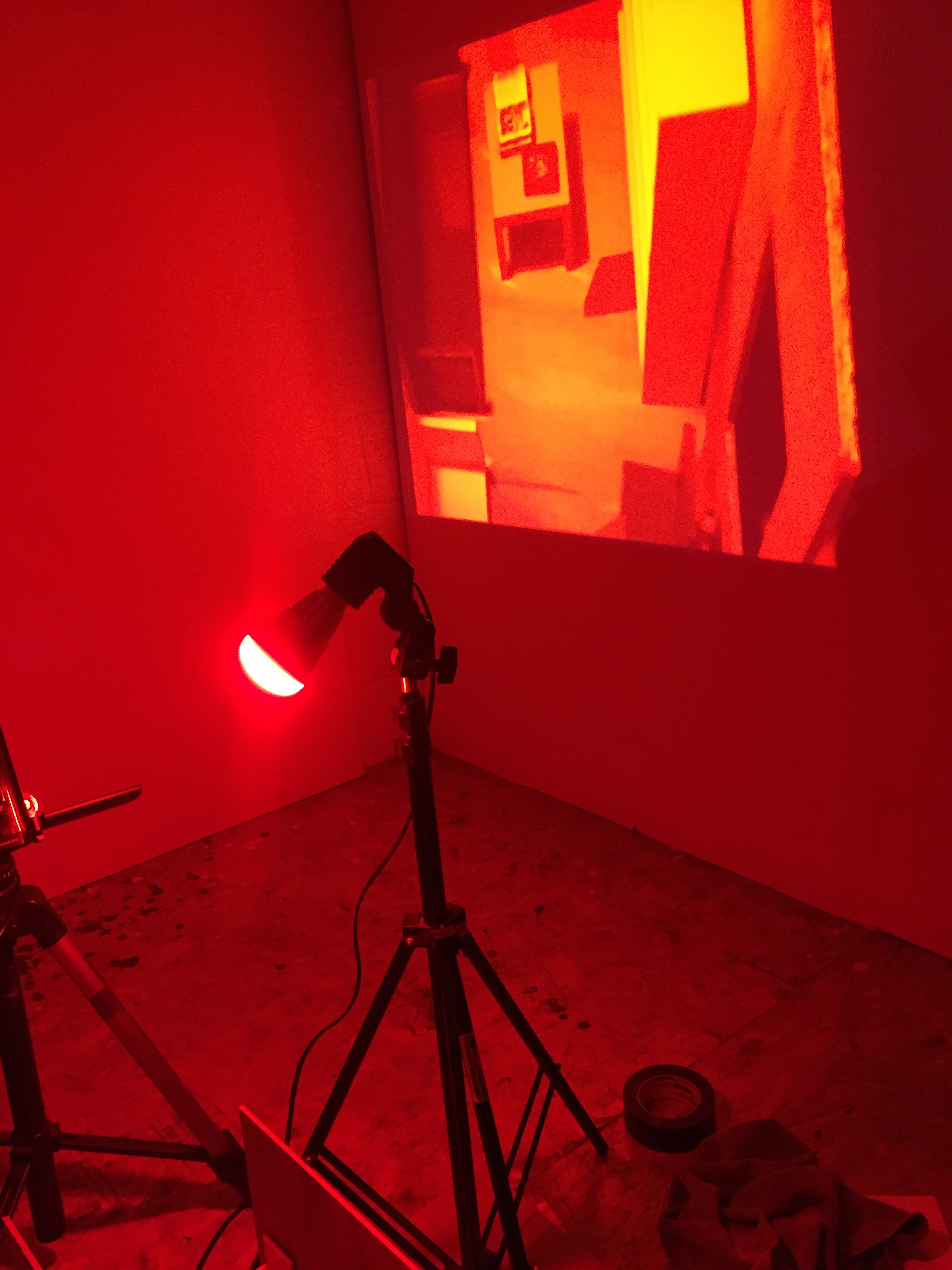
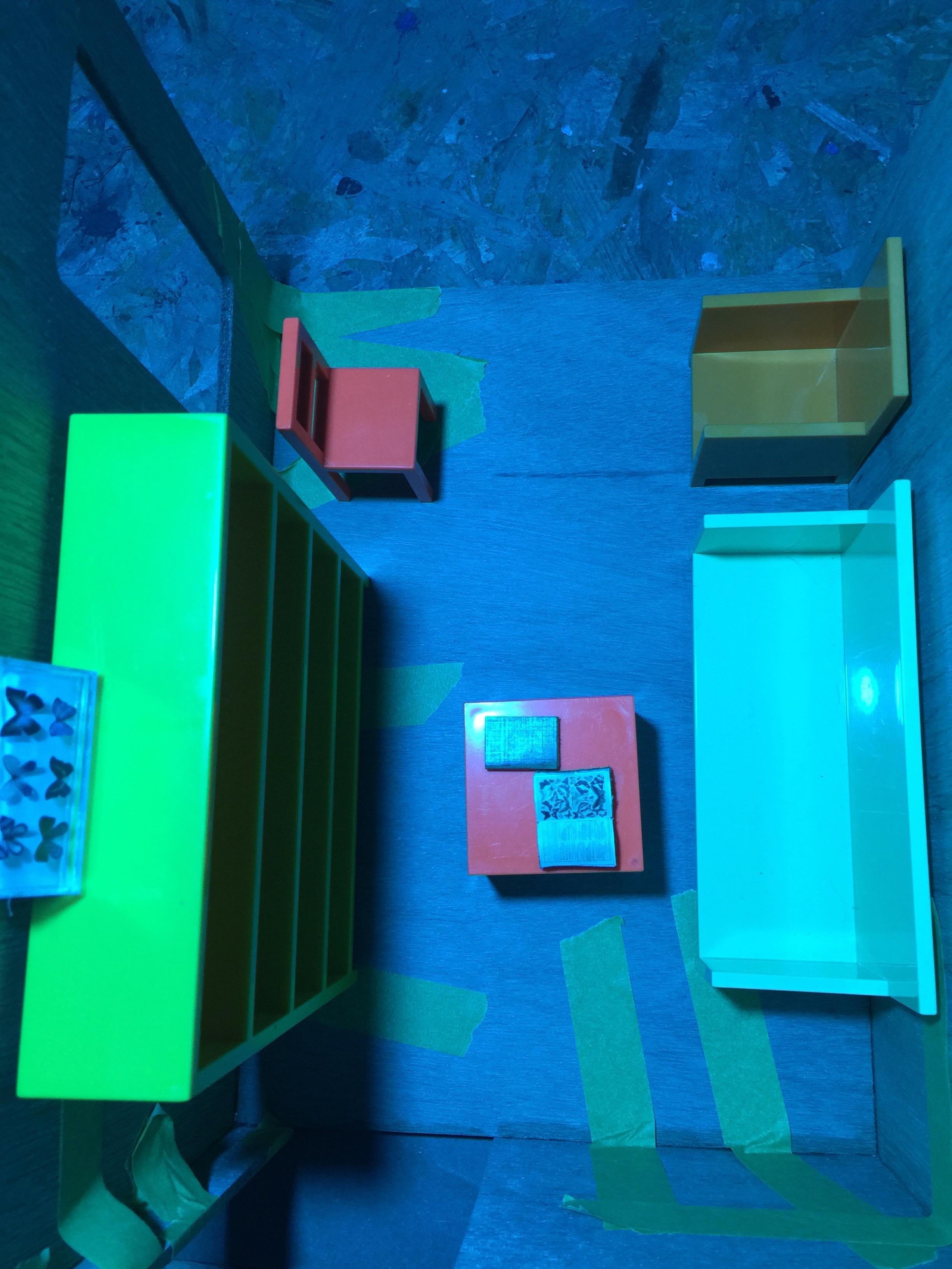
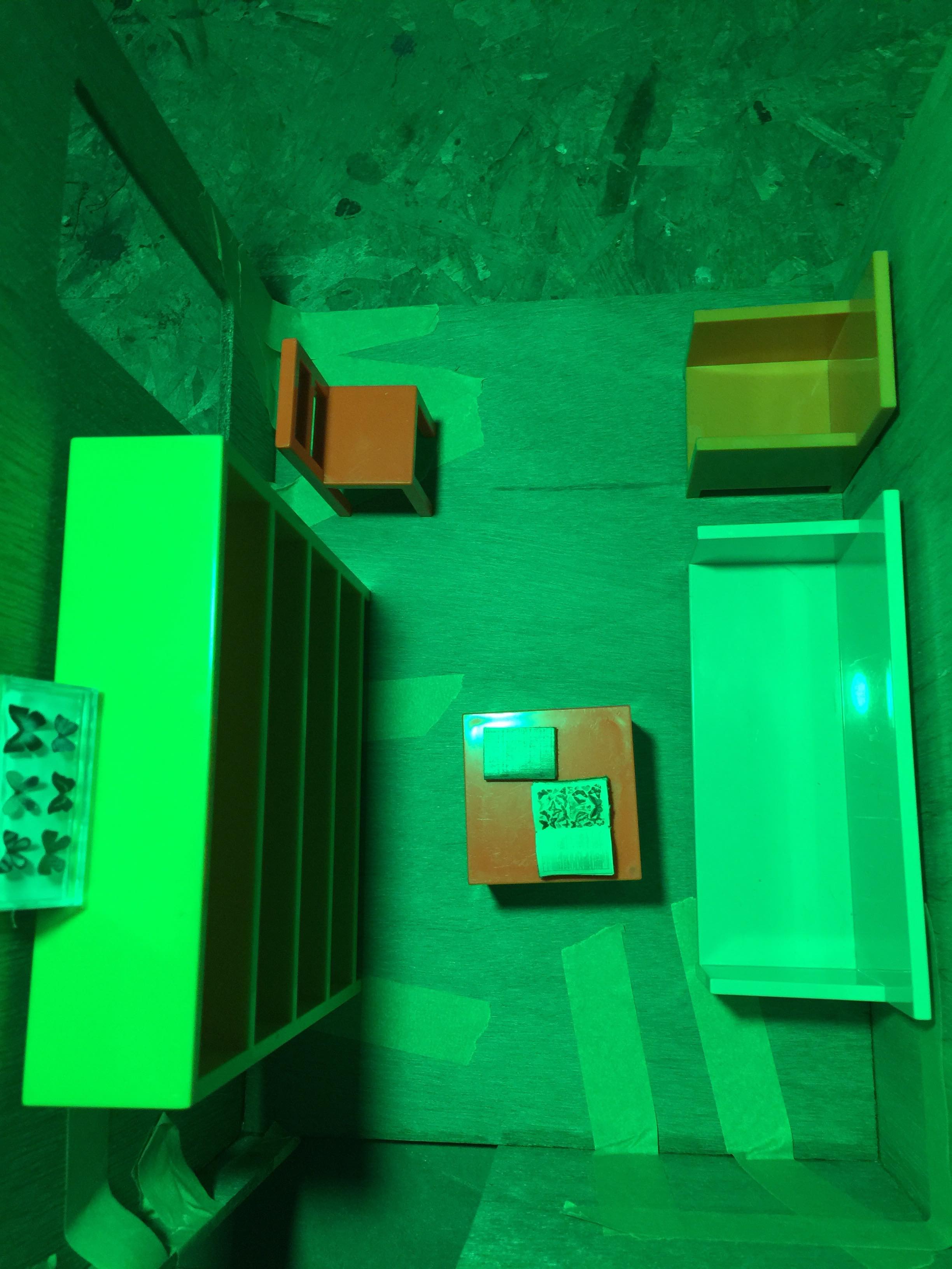
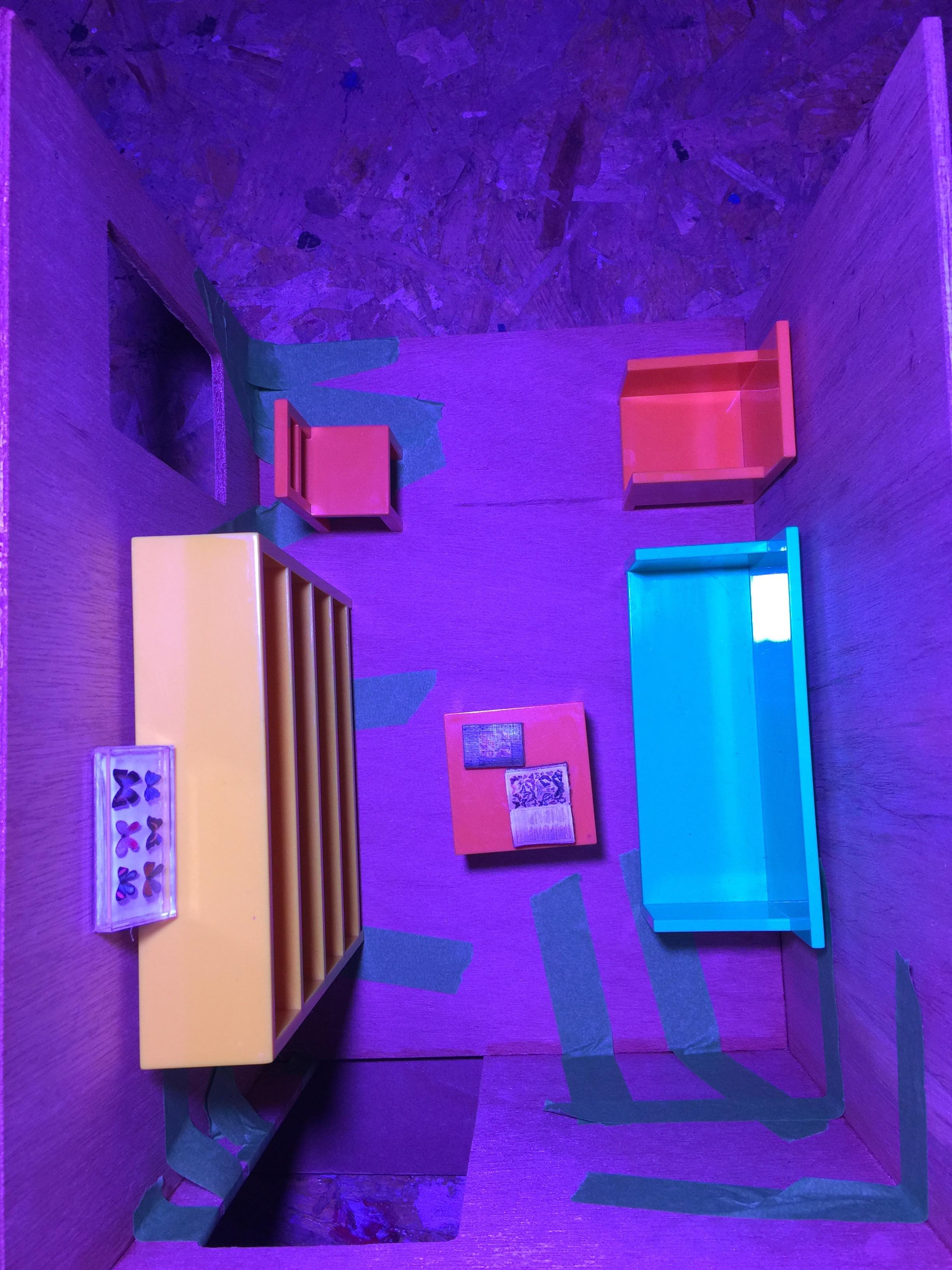
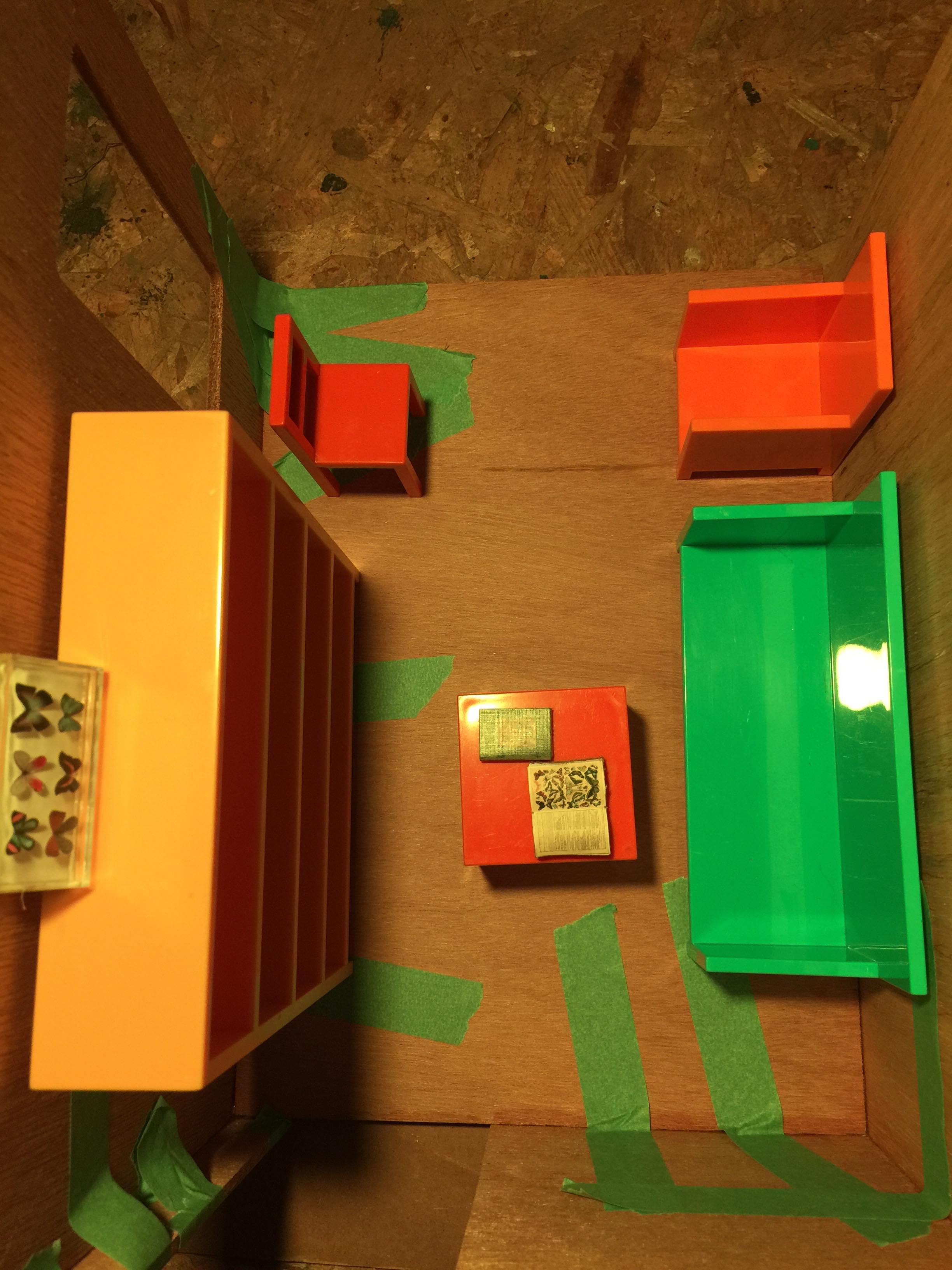
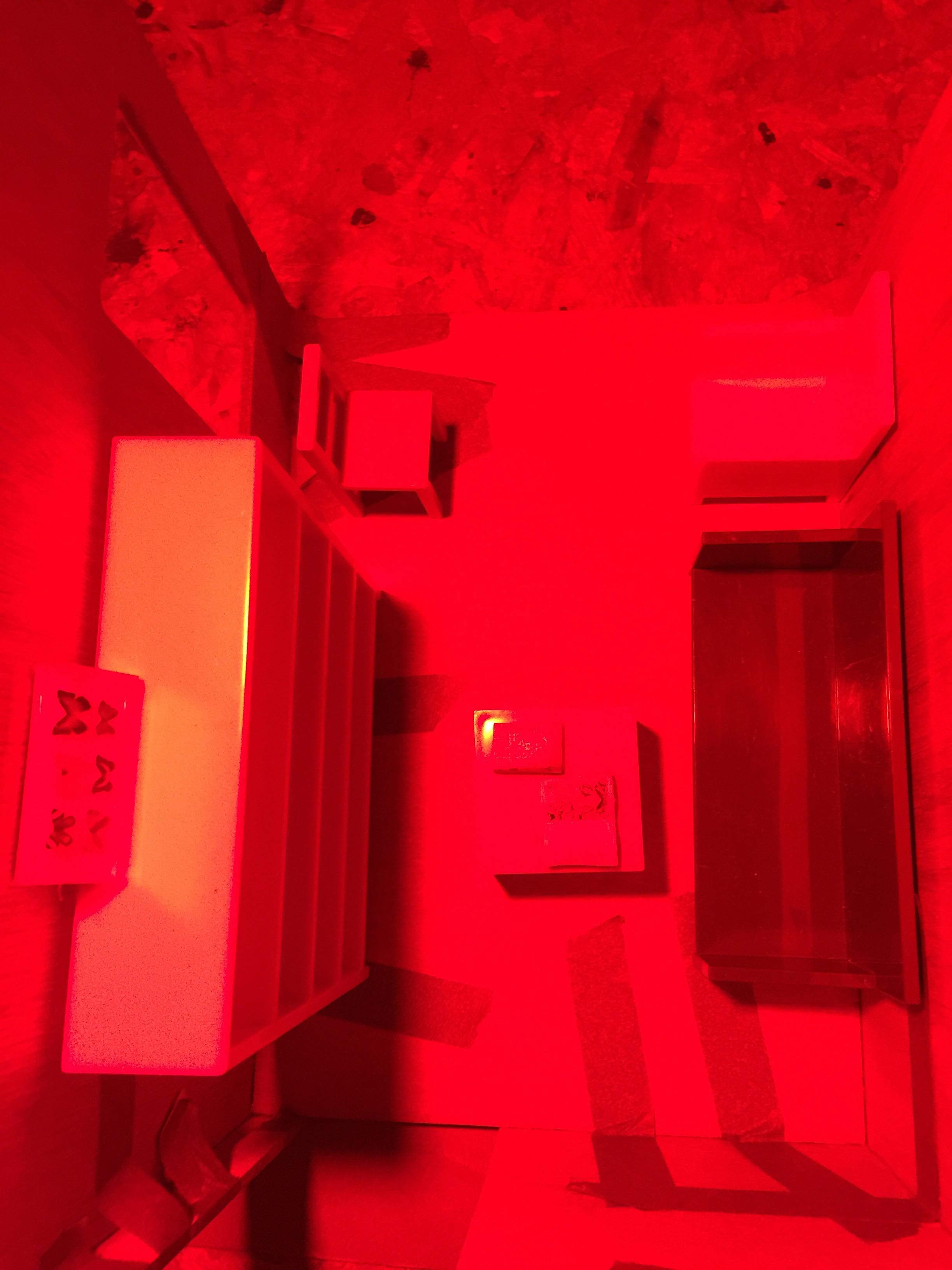
The installation, called “Color Changing Room,” is a publicly accessible, miniature-sized room filled with multi-colored objects. A light in the room changes colors through the visible spectrum to bright white, along the way illuminating objects of the same color (i.e. a red light wavelength makes all red objects glow, and so on), while other colors in the room that do not match the color of light appear to be black or white. There are books in the room various subjects related to nature and science, and a magnifying glass. The project is a commentary on color perception. The participant, in theory, if they were tiny, would be invited to sit in the room and look at the objects in nature through a magnifying glass, and see that they are highlighted or muted drastically based on which color is highlighting the room, as well as on the furniture around them.
If installed in public, hypothetically in New York City on a place like the The High Line, it would be open during the day and closed at night. At night, a live video feed of the room would be projected onto a nearby billboard (somewhere in enough darkness to show up), showing the colors changing in the room, the colors again altered through digital imaging. This step would be a commentary also on color perception, but through digital technologies. Often, the colors we think we see are not “real.” Even in full spectrum daylight, how do we know what color is “real”? It is all just an illusion of how our brain perceives light on objects around us.
I often think of this when attempting to work in the program Unity; in Unity there is no light pollution. There is no sun. All is black, until you add a light. Essentially, lighting is everything; it is how we see our world, and how we see our world is further manipulated through digital technology.

The visible spectrum of colors is only a tiny small segment of the electromagnetic spectrum, after which there is a long strip of infrared (and “red”) light that we do not see, but feel, from the sun. Red is also the longest visible wavelength. Through talking with Eric Rosenthal, expert in color vision, I also learned that red is the color we see first; red is associated with fire, in essence, things we need to react to quickly. Therefore, there are danger associations with red. However, the sun is also the life source for our planet; if you turn a plant towards the sun, it will grow towards it. Thus the sun, or the color red, gives us life.
We also discussed how on the other side of the danger spectrum, there is blue, or “Ultraviolet” light. Blue light is the shortest wavelength; it is only present in our world when the sun is high. If you get too close to UV light, your skin will burn. Thus, you want to filter this from your vision. It is also the wavelength that keeps us awake, that we fill office spaces with, that we go out into in order to wake up and feel alive. Our relationships with color are now also mediated through technology. Here is an excerpt from my interview with Eric:
Blue light’s very controversial….Your body is expecting less blue, when it wants to go to sleep, the theory being the sun has set, therefore [your body is not expecting as much light in the blue wavelength]….So, where there’s evidence, where there’s bright sunlight, where there’s Ultraviolet, you want to filter the Ultraviolet from your vision, because Ultraviolet is just like giving you sunburn, it destroys your skin cells, that’s the same kind of thing that can happen to your cells in your eye, in the retina, with cones and rods. They can be affected by too much Ultraviolet. So you wear sunglasses, ok? But there’s evidence that proves that. Whereas the blue light, there hasn’t be enough studies or evidence to substantiate.
The paradoxes involved in color psychology and nature are something I am studying here as a starting off point, which led me to study the use of warm and blue lighting in interior spaces, and this in between place between danger and nourishment. From this standpoint, I read a series of studies on PubMed at Margaret’s suggestion, and came to the conclusion that while the studies are new, it is indeed true that blue light seems to keep us up at night, and warm lighting is more relaxing. I began to wonder if these colors could be used in isolated ways in public art to draw attention to this. It also seemed natural to try to also gear these public installations for therapeutic uses, as well as to generate a conversation about colors and how we react emotionally to them when isolated, and be more aware of these wavelengths in our daily lives.
While at first I was leaning towards are didactic approach about blue lighting vs warm lighting in favor of the warmer lighting, my conversation with Tom Igoe led me to rethink this. He pointed out that in our daily lives, especially indoors, decisions have been made for a series of reasons, and it is important to understand these reasons before criticizing the choices that have been made. For example, people need blue light (or full spectrum light including blue) indoors to see, and to stay awake. Other lights have been chosen in places due to their efficiency, such as sodium lights in car parks, which also isolate yellow wavelengths. I began to steer away from seeing one as good and one as bad, and more towards a general awareness of these wavelengths in our lives, and how they could be used. Since I have also been researching in general the use of sound, color and light for therapy and therapeutic installations or uses, I began to think that I could synthesize my research into the everyday lighting into something more magical, and wind back to the idea of a public installation that could also be enjoyable for the senses, while pointing out some of the other more scientific elements of how these colors are present in our lives.
I interviewed two artists work in public art who use a great deal of color in their work. The first person was Julia Vogl, who has done a number of large or smaller scale works using color. She stressed that “Public Art has had huge benefits in giving pride and ownership to a community and an increased sense of safety” and the idea that public art can lower crime rates and enable people to be out in public more, and create a “beneficial emotional connection in a place.” She said she was inspired by using color palettes similar to a bowl of candy, or a bunch of balloons or a bouquet of flowers, in other words, using colorful, happy, engaging associations, to draw people into more serious conversations. She also discussed the cultural uses of color, and a project she did in Hong Kong which used the colors of the five elements in Chinese medicine. Julia also referenced her work with a neuroscientist, who claimed that certain colors are more calming, such as blues and purples, which are more likely to be used for a permanent public piece. They also recommended not making something too dark and thinking about the landscape around it, and what that piece is supposed to do to enliven the space but also be calming. She also described using earth tones in a piece for a bereavement center, where all reds were taken out of the colors used. She said: “The most important thing about public art is how do you engage the community that’s actually going to use it and at the same time make them feel comfortable.”
Another note that stuck me from our conversation was her saying that temporary art is very powerful. For one, structures and colors are hard to maintain in public over time. Conceptually, people also take notice of things more of they are only temporary and different from their normal landscape, versus fixed as a permanent fixture in the architecture of a place, which tend to blend in over time as they get used to its presence. My other interviewee, Graham Coreil-Allen, who works on site-specific works promoting social engagement and public safety in Baltimore, also highlighted the temporary as something powerful in this way, and how if you don’t engage through art on another level beyond visual you miss out on an opportunity to create a conversation, and described how he was trying to synthesize interests in radical situationist theory” and “change a city through intervention to improve places and affect politics,” and tying his work back to “public art was a way to synthesize interest in sculpture, art and activism.”
I ended my conversation with Julia tying back to her grad school manifesto, which she said was “Artwork has to engage, has to be site specific, art has to include an element of decor” as well as visually communicate: “Why not be beautiful and why not be effective and have a discussion about the work?”
Based on this, and my research on the psychology of color and work outside of our class in audio-visual installation, I am now coming back to my own practice in audio-visual art, and will propose an installation of an room in an outdoor space during winter that is heated, which would be lit up blue during the day and warm colors at night. This installation would provide both a refuge from the cold and a place for color/light (and possibly sound) immersion, providing public light and color therapy in our darkest months, as well as highlighting the needs for blue light or sun during the day, and relaxing colors at night, as part of how the human biology works and what it needs to feel balanced. The intention would be to have people be more aware of their everyday lighting choices, and how colors affect us, as well as create a public installation that would hopefully also create a space of wonder and new perspective on something we experience on a subconscious level every day.
I also read that blue light is better for plant growth, while red light is better for producing fruits. An analogy can be made here for humans; I will include this in an accompanying video along with a physical maquette for the installation, and possibly incorporate the image of the plant into the final installation idea as well.
Final project proposal
For my final project in The Code of Music, I would like to expand upon a gesture-controlled instrument that I am building by creating a new sound palette for it. For our class I would like to come up with some musical/synthesized motifs that could be manipulated with gesture. Ideally I would like to have the instrument be something that others could play with as an interactive installation, or at least a tool I could use for performance.

early caricature of a color organ in use
The instrument itself is made of a set of acrylic tubes meant to emulate pipes. The inspiration or idea was to create a deconstructed “color organ” (see image on right) meets theremin. Lights inside the pipes are triggered based on hand gestures in the air around it along with triggering sounds mapped in a similar way, making the composition a bit unpredictable, but with time you can get the hang of it and repeat gestures, or enjoy the randomness.
I would be using a combination of Max MSP and MadMapper, controlled by a LeapMotion.

sketch of instrument/interaction
instrument being built in second messy prototype phase… (it does light up, but I’ll save that part for when it’s done for class!)
This is the first time I have made music with gesture (at least with hands waving in the air.) I think it could be an interesting segue from the midterm where I started to explore introducing different sounds/patterns and showing them with associated colors. In essence, this is a way to visualize the music as well, as well as to trigger/spatialize the sound in a stereo field, and allow room for more expressivity.
1. A description of your project.
I originally was planning on proposing a public installation/sculpture of two rooms, one a living room with warm lighting, and the other one the an office space or corporate lab environment with cold lighting. Possibly the colors would be exaggeratedly saturated yellow and blue-tinged. In each room, there would be experiments happening regarding color and light; some D.I.Y. experiments in the living room, and highly scientific experiments in the lab, both tracking the effects of light on humans.
However, I got feedback from a couple of people I interviewed that it would perhaps be more interesting to isolate certain colors/wavelengths in just one room rather than having two rooms, and have the lighting change back and forth to highlight the differences, in part to highlight a psychological change (maybe) that the colored light change causes but also to show how the different light bulbs change the perceived color of everything in the room.
So now I am thinking of making a prototype for a hypothetical art piece in ONE room, with different colored lights changing to light the room.
There will also be a miniature library of science books, and an open book about butterflies, and one about nature, and different colors of furniture. The different colors of light in the room will be really apparent by how they change the perceived colors of objects in the room. Instead of buying Dichroic filters, which Eric Rosenthal told me about (I would like to try those at some point), I will use colored gels to simulate isolating certain color at certain wavelengths. I am thinking James Turrell meets Laurie Simmons type diorama with lighting. I also just saw this artist’s work on Instagram and am very intrigued by this style, it is kind of similar to what I am thinking about for the prototype, though maybe more zoomed out, showing colored light inside from the outsides of buildings.
The general idea is to encourage questioning of perception of color, the “real” color of things, and mindfulness of your surroundings. Maybe this is too obvious? But I think there could be a way to show that in a way that makes you see it from another angle? I still need help with the message, but am closing in on an initial form.
2. A concise project research question(s) and plan for discovery (i.e., which papers/books, which interview subjects, and what forms of experimentation)
Some Books
Also some clinical trials which are listed in my research post below.
2. Who will engage with your project: how, where, and why?
It would ideally be a public installation for anyone, probably in a city though, or an outdoor art space in a place that is frequented by many people (such as a public garden), maybe during the winter temporarily with heating. It could be a place to get warm and read/do research in a very public place. Perhaps it would be somewhere where people are often moving through very frequently and quickly, like Times Square, or outside of a subway station. Probably one wall would be transparent so that others outside can see you inside.
3. What do you want your project to DO?
I want it to encourage people to be more mindful of their surroundings/perception. I haven’t decided if cold light is “bad” for us and warm light is “good” for us or if I would like to frame it that binary way. Instead I would like to just point out different modes of perception of color and space as a way of drawing attention in general to our surroundings, and to how color and light affects our perception and perhaps also our psychology, most often subconsciously, by highlighting it very obviously. As for a call for action, I’m not sure. Maybe the participant would choose their lighting differently in their home or working space.
Plan your remaining 4 weeks and schedule it
This week: I ideated on the final form it will take and acquired materials for building the maquette of this hypothetical installation. It will be a little room with (at least) two different lights shining into it at changing intervals, yellow to blue to follow the warm/cold light theme, or cycling through colors.
Next week: Assemble maquette. Figure out lighting.
Following week: Create a presentation to go with the maquette to describe my process and the “why.”
Q: Have you interviewed your experts? Transcribed the interview yet?
I have interviewed two artists working in public art, Julia Vogl and Graham Coreil-Allen, and took extensive notes. I also recorded and have transcribed an interview with Eric Rosenthal on color perception. I also spoke with Tom Igoe on the technicalities of lighting technology but did not record it, however he recommended that I read a few books, and I took notes. I did not hear back re: neuroscience and art but have downloaded some books on the subject (which are shown above.) I am continuing to look at clinical trials on warm and cold/blue lighting.
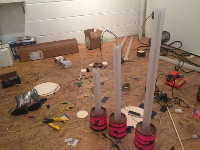
Prototype - Stage 2
These images are missing the details which will come later…such as the science books, etc, perhaps a figure representing a human, and the pieces being fully assembled/glued, and the light mounted somehow or hung on a stand (or, possibly, LED.) Another option like I mentioned before is to use colored gels and just have regular white lights shining through them. But the bare colored bulb suspended above somehow does the trick and perhaps is most direct.
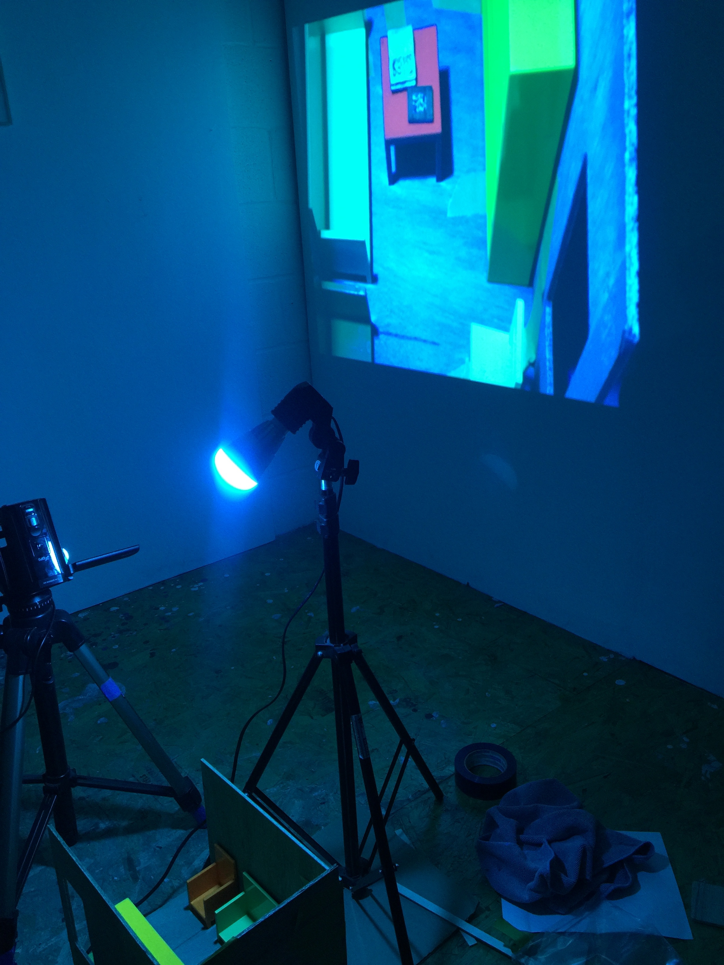
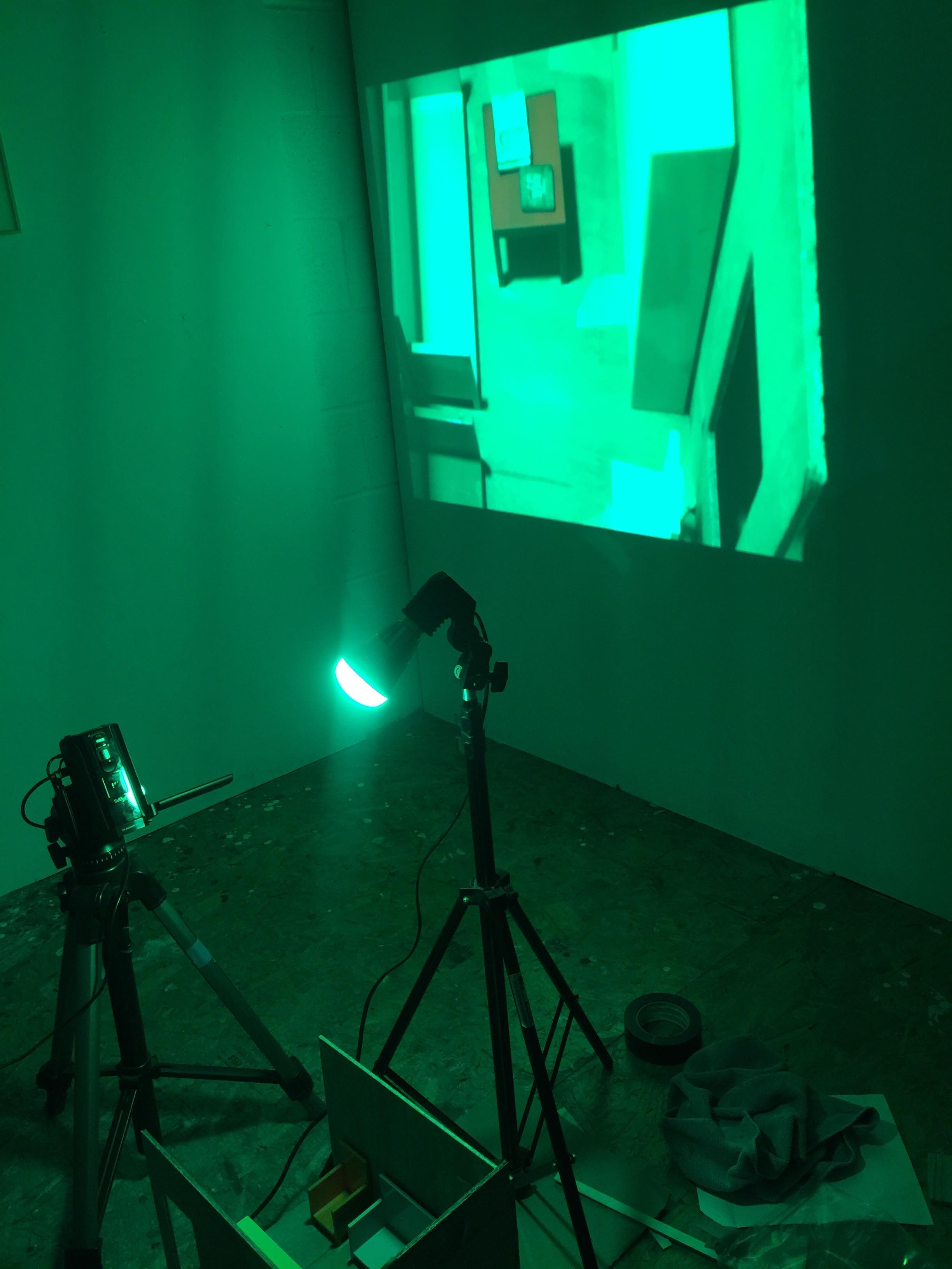
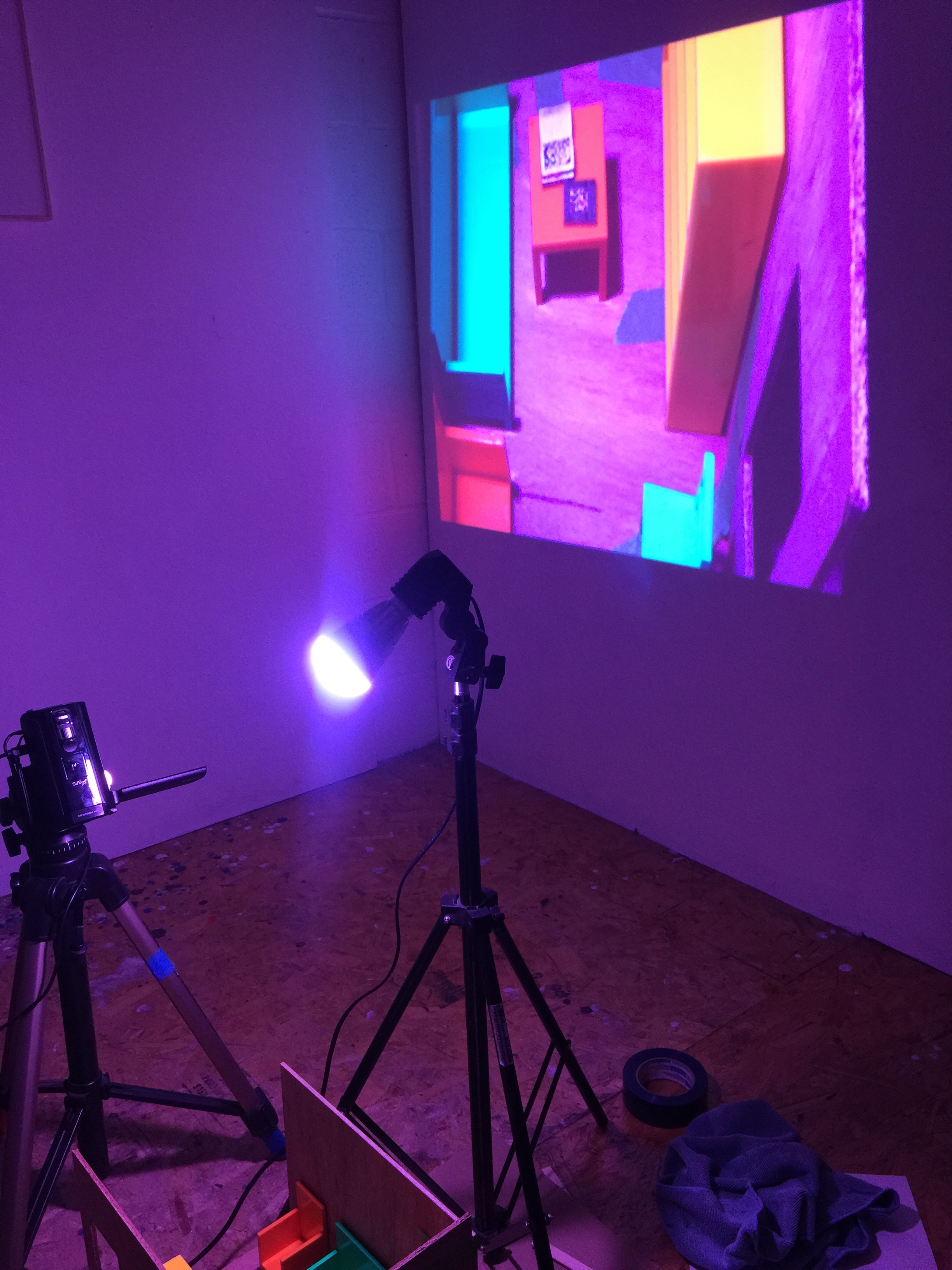
Update 11/29:
These are photos of the expanded installation with a blow-up/projection of the miniature room on the wall behind it. The color variation is even more pronounced in the digital video, which I learned (from my chat with Eric Rosenthal) is also created in the opposite way of how we see (each pixel has 2 greens, 1 red and 1 blue.) So my point is actually highlighted further in the digital image, which could make the project also address how color in digital imagery is off even further than objects under light in reality. I need help tying this all together for TEx, so it will be helpful to meet with a feedback group today.
SOME BACKGROUND
In the video above producer James Wiltshire calls techno the “perfect balance between human analog inspiration and the technology around it,” and goes on to say that modern techno is a “perfect balance between humans and digital technology.” In this way, it seems that modern techno is a perfect musical tool for interfacing as humans with the automated world around us.
He also references the 1980 novel The Third Wave, where the author Alvin Toffler talks about a future that is half-machine, half-human. In the novel he describes a wave of technology coming forward and changing society (Note: this was written almost 40 years ago, and what he was anticipating has since come to pass.)
According to Toffler, the second wave was the industrial revolution, the third wave was the incoming information wave. He foresaw a a new technology and new society which would waylay what came before it.
Early Krautrock band Kraftwerk were some of the early adopters of electronics as a means for creating “automatic” sounding music created by humans using tools from the wave of technology Toffler describes, as can be heard in their 1982 album Computer World, which explores this relationship between human and machine through their brand of proto-techno music.
According to Wikipedia, however, the term techno was not officially used as a word for a genre until later on, in 1988 in the context of Detroit techno, which is “seen as the foundation upon which a number of sub-genres have been built….To producers such as Derrick May, the transference of spirit from the body to the machine is often a central preoccupation; essentially an expression of technological spirituality. In this manner: ‘techno dance music defeats...the alienating effect of mechanization on the modern consciousness.’”
The central rhythmic component is most often in common time (4/4), where a single measure is divided into four beats marked by a bass drum on each quarter note pulse. Each beat can be further divided, with eighth notes dividing each quarter note in half and sixteenth notes dividing each quarter note into quarters. Famously called “four-on-the-floor,” the bass drum is the automated heartbeat or metronome around which all other sounds fall into place: a backbeat played by snare or clap on the second and fourth beats of the measure, and an open hi-hat sounding every second eighth note. The tempo tends to vary between approximately 120 to 150 beats per minute (bpm), depending on the style of techno. Techno focuses more on sophisticated rhythm and repetition (cross rhythm, syncopation) than it does on melody or chord progression. The development is gradual where many sounds are layered and altered over time. All of these characteristics together create something automatically definable as techno.
Techno is a landscape. It’s a reaction and artistic statement about the actual automated world that we live in. It’s half machine & half human! Techno’s highly repetitive and mechanic rhythmic structure against human expressivity in sampling, modulating, remixing and looping shapes its unique art form.
PROCESS
From here, our group identified three elements of modern techno music:
Repetition - “four on the floor” as basic unit
Instruments being layered/omitted one by one over the course of a song
Altering/modulating a sound texture gradually over time
With the elements in mind we think the best way to explain how techno music works is by deconstructing an existing techno song into individual instrument layers as the building blocks. We will have users rebuild their version of the track by adding and subtracting layers and playing with different combinations on top of the 4/4 rhythmic structure, and give them expressive controls over multiple parameters that control certain layers.
First, Ada built a sketch in p5 taking individual instrument layers from the song “Solace” by Pan-Pot and looped each layer/pattern and synced them to the TransportTime, so that no matter when the user turns on the layer, the layers will always be in place with one another.
We met and listened to the sounds together, which were triggered in time in sync with a four-on-the-floor bass drum, and brainstormed about how we could expand this to be an educational tool. Inspired by Valentina’s presentation with the different musicians for the fantasy Blues band, we came up with the idea to present different options for each of the elements, to give the user in our museum some feeling of agency of being able to choose their own sounds and filters within the constraints of a techno infrastructure.
We discussed that one essential element of techno is patience; elements often come in one by one, being introduced over the course of the song mathematically according to how long it has been since the last element was introduced. Since it is hard to teach patience, we instead decided to create an interface that would inhibit the need to do everything at once, while providing enough options to allow the user to create something that they feel is their own.
After brianstorming, Adi created the interface. Our interface is inspired by the popular DAW Ableton Live, which many artists use to create techno tracks. Each sound (in our case: a bass drum, multiple hi-hats, clicky percussion, rim, bass, brass hooks, pad drone, and a sequence) has a button to enable it below, with a selection of different sounds to choose from, with a visual indicator to show where in the timeline the sound is out of 4/4 -- all following the kickdrum as the heart of the song.
INSTALLATION
For a museum environment, we imagine that our installation could be shown as it is now, on a screen, for the user to play with using headphones or with speakers with instructions popping up from time to time to prompt users to enable or modulate clips, similar to the Jazz.Computer. This is to suggest users what could be a proper progression of a techno song, but it's up to them to follow the instruction or not. It could also be installed in a more immersive environment, such as in a room with surround sound, featuring tactile buttons that would trigger each sound with visual feedback such as flashing brightly colored squares, rectangles, circles, lines, etc. on the walls around the user, which would line up with the instruments they have selected and where they are in the timeline.
THE SKETCH