The Temporary Expert

Day 468 @ ITP: The Temporary Expert

Final project : Sky Box

skyboxunionsquare.jpg

FINAL PROPOSAL

My final project proposal was for a public light therapy room called Sky Box, taken from the place where you manipulate lighting in the 3D gaming program Unity, which is called Skybox, and also as a reference to James Turrell’s Skyspace series.

The installation would be installed temporarily outdoors in public during the winter.

Inside it would be heated and artificially lit with bulbs that change color along the pattern of a long summer day from sunrise to sunset, which would not match the real exterior of what is currently going on in the sky.

In the center, a real tree is planted, nurtured by the heat and light.

In the morning the Sky Box would turn a full, rich blue, and at sunset, a full, rich red, and a spectrum of the two in between. This highlights the color spectrum of blue and red, which we vacillate between every day.

REFLECTION

(Note: A reflection on my research and interviews can be found here.)

After our critique, I am now thinking that this could also potentially be a smaller scale installation that the viewer would view from the outside or through sticking their head inside it from below, or potentially with projections in an indoor gallery space. I am imagining something like the Tiffany windows displays on Fifth Avenue meets a peep show, but light (and possibly sound) therapy-themed. It also became clear that not everyone would want to be in such a space; it needs more to draw people in. I was thinking sound may be it, but am open to other avenues. Something as simple as good seating could be enough, or a place to plug in your phone or watch short videos, and/or view more miniature installations inside.

In the end, I feel that the project became a commentary on lighting in real versus artificial spaces, as well as hopefully an inviting public space, all conceptual meanings aside. The ultimate aim in the end was to create a respite from the cold and dark and a place that people would want to visit to recharge. Through my experimentation, research and interviews in making the project I found that something too critical did not seem fitting in the end; making a sensory experience based on the research seemed to make more sense for me.

A further iteration of this piece would also possibly include sound, which could be manipulated either by people in the space or by other data. I am still not sure what data would make most sense or add to this project though — perhaps the location of the Sun either in real time, or in the artificial space’s time.

Over the course of this project it also became apparent to me that the Dream House was a big source of influence. The Dream House has a lot of rules and meaning behind its creation, but they are not forced on you when you visit it. In fact, it takes some probing to find out the background of why or how it exists. Still, the visceral reaction to it is still there, mostly to the sound, but also to the sound in relationship to light, and also how the sound changes based on where you are in the room, which creates a greater general awareness.

In retrospect, I was also thinking that ideally the lights would be run by solar energy, as well as the heat. This also ties into my work on the field guide earlier in the semester, and I think having the installation be solar-powered would bring greater meaning to the presence of light and tie it more directly to the sunlight (or lack thereof.)

Clearly, this is all hypothetical. I will be continuing to work on these themes though for thesis. I found it helpful to imagine big or most likely unrealistic first, then will bring it to a smaller scale to try and put it into practice. I also will continue to read the large bibliography I created in this class, as I was only able to get through parts of it for this project, but it will be very helpful for thesis as well and I am grateful to have these resources thanks to our class.

Google Slides presentation:
https://docs.google.com/presentation/d/1BvA-XGk2hS4GIn5ZA3Kgm832FMYI3d0hsKwRtu1SM7s/edit?usp=sharing

Video for Google Lens:

Thanks to Julia Vogl, Graham Coreil-Allen, Eric Rosenthal and Tom Igoe for participating in interviews for this project, and to Marina Zurkow, our classmates and fellow ITP-ers for the helpful advice.
Day 455 @ ITP: The Temporary Expert

The visible spectrum of colors is only a tiny small segment of the electromagnetic spectrum, after which there is a long strip of infrared (and “red”) light that we do not see, but feel, from the sun. Red is also the longest visible wavelength. Through talking with Eric Rosenthal, expert in color vision, I also learned that red is the color we see first; red is associated with fire, in essence, things we need to react to quickly. Therefore, there are danger associations with red. However, the sun is also the life source for our planet; if you turn a plant towards the sun, it will grow towards it. Thus the sun, or the color red, gives us life.

We also discussed how on the other side of the danger spectrum, there is blue, or “Ultraviolet” light. Blue light is the shortest wavelength; it is only present in our world when the sun is high. If you get too close to UV light, your skin will burn. Thus, you want to filter this from your vision. It is also the wavelength that keeps us awake, that we fill office spaces with, that we go out into in order to wake up and feel alive. Our relationships with color are now also mediated through technology. Here is an excerpt from my interview with Eric:

Blue light’s very controversial….Your body is expecting less blue, when it wants to go to sleep, the theory being the sun has set, therefore [your body is not expecting as much light in the blue wavelength]….So, where there’s evidence, where there’s bright sunlight, where there’s Ultraviolet, you want to filter the Ultraviolet from your vision, because Ultraviolet is just like giving you sunburn, it destroys your skin cells, that’s the same kind of thing that can happen to your cells in your eye, in the retina, with cones and rods. They can be affected by too much Ultraviolet. So you wear sunglasses, ok? But there’s evidence that proves that. Whereas the blue light, there hasn’t be enough studies or evidence to substantiate.

The paradoxes involved in color psychology and nature are something I am studying here as a starting off point, which led me to study the use of warm and blue lighting in interior spaces, and this in between place between danger and nourishment. From this standpoint, I read a series of studies on PubMed at Margaret’s suggestion, and came to the conclusion that while the studies are new, it is indeed true that blue light seems to keep us up at night, and warm lighting is more relaxing. I began to wonder if these colors could be used in isolated ways in public art to draw attention to this. It also seemed natural to try to also gear these public installations for therapeutic uses, as well as to generate a conversation about colors and how we react emotionally to them when isolated, and be more aware of these wavelengths in our daily lives.

While at first I was leaning towards are didactic approach about blue lighting vs warm lighting in favor of the warmer lighting, my conversation with Tom Igoe led me to rethink this. He pointed out that in our daily lives, especially indoors, decisions have been made for a series of reasons, and it is important to understand these reasons before criticizing the choices that have been made. For example, people need blue light (or full spectrum light including blue) indoors to see, and to stay awake. Other lights have been chosen in places due to their efficiency, such as sodium lights in car parks, which also isolate yellow wavelengths. I began to steer away from seeing one as good and one as bad, and more towards a general awareness of these wavelengths in our lives, and how they could be used. Since I have also been researching in general the use of sound, color and light for therapy and therapeutic installations or uses, I began to think that I could synthesize my research into the everyday lighting into something more magical, and wind back to the idea of a public installation that could also be enjoyable for the senses, while pointing out some of the other more scientific elements of how these colors are present in our lives.

I interviewed two artists work in public art who use a great deal of color in their work. The first person was Julia Vogl, who has done a number of large or smaller scale works using color. She stressed that “Public Art has had huge benefits in giving pride and ownership to a community and an increased sense of safety” and the idea that public art can lower crime rates and enable people to be out in public more, and create a “beneficial emotional connection in a place.” She said she was inspired by using color palettes similar to a bowl of candy, or a bunch of balloons or a bouquet of flowers, in other words, using colorful, happy, engaging associations, to draw people into more serious conversations. She also discussed the cultural uses of color, and a project she did in Hong Kong which used the colors of the five elements in Chinese medicine. Julia also referenced her work with a neuroscientist, who claimed that certain colors are more calming, such as blues and purples, which are more likely to be used for a permanent public piece. They also recommended not making something too dark and thinking about the landscape around it, and what that piece is supposed to do to enliven the space but also be calming. She also described using earth tones in a piece for a bereavement center, where all reds were taken out of the colors used. She said: “The most important thing about public art is how do you engage the community that’s actually going to use it and at the same time make them feel comfortable.”

Another note that stuck me from our conversation was her saying that temporary art is very powerful. For one, structures and colors are hard to maintain in public over time. Conceptually, people also take notice of things more of they are only temporary and different from their normal landscape, versus fixed as a permanent fixture in the architecture of a place, which tend to blend in over time as they get used to its presence. My other interviewee, Graham Coreil-Allen, who works on site-specific works promoting social engagement and public safety in Baltimore, also highlighted the temporary as something powerful in this way, and how if you don’t engage through art on another level beyond visual you miss out on an opportunity to create a conversation, and described how he was trying to synthesize interests in radical situationist theory” and “change a city through intervention to improve places and affect politics,” and tying his work back to “public art was a way to synthesize interest in sculpture, art and activism.”

I ended my conversation with Julia tying back to her grad school manifesto, which she said was “Artwork has to engage, has to be site specific, art has to include an element of decor” as well as visually communicate: “Why not be beautiful and why not be effective and have a discussion about the work?”

Based on this, and my research on the psychology of color and work outside of our class in audio-visual installation, I am now coming back to my own practice in audio-visual art, and will propose an installation of an room in an outdoor space during winter that is heated, which would be lit up blue during the day and warm colors at night. This installation would provide both a refuge from the cold and a place for color/light (and possibly sound) immersion, providing public light and color therapy in our darkest months, as well as highlighting the needs for blue light or sun during the day, and relaxing colors at night, as part of how the human biology works and what it needs to feel balanced. The intention would be to have people be more aware of their everyday lighting choices, and how colors affect us, as well as create a public installation that would hopefully also create a space of wonder and new perspective on something we experience on a subconscious level every day.

I also read that blue light is better for plant growth, while red light is better for producing fruits. An analogy can be made here for humans; I will include this in an accompanying video along with a physical maquette for the installation, and possibly incorporate the image of the plant into the final installation idea as well.

Day 440 @ ITP: The Temporary Expert

1. A description of your project.

I originally was planning on proposing a public installation/sculpture of two rooms, one a living room with warm lighting, and the other one the an office space or corporate lab environment with cold lighting. Possibly the colors would be exaggeratedly saturated yellow and blue-tinged. In each room, there would be experiments happening regarding color and light; some D.I.Y. experiments in the living room, and highly scientific experiments in the lab, both tracking the effects of light on humans.

However, I got feedback from a couple of people I interviewed that it would perhaps be more interesting to isolate certain colors/wavelengths in just one room rather than having two rooms, and have the lighting change back and forth to highlight the differences, in part to highlight a psychological change (maybe) that the colored light change causes but also to show how the different light bulbs change the perceived color of everything in the room.

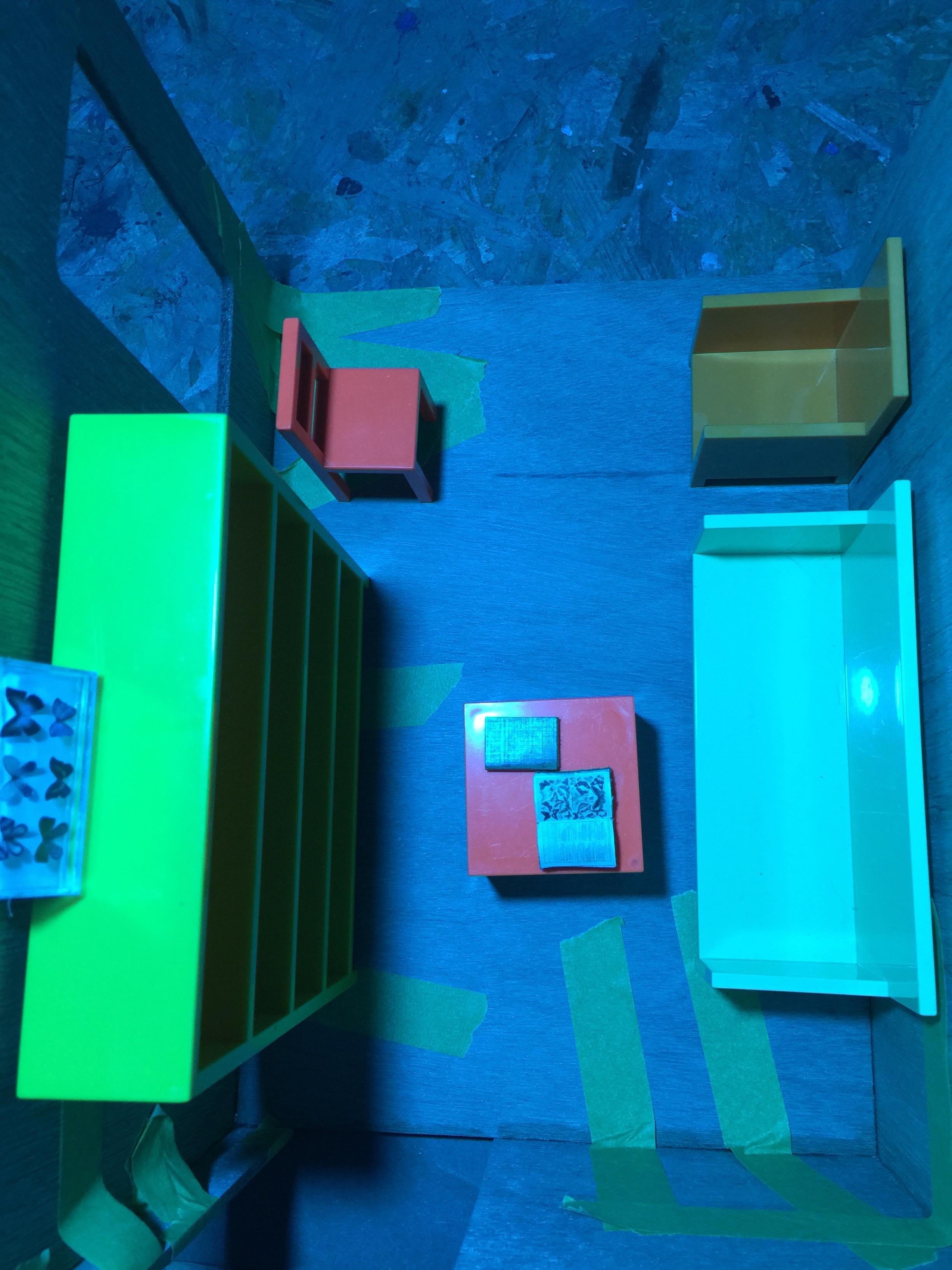
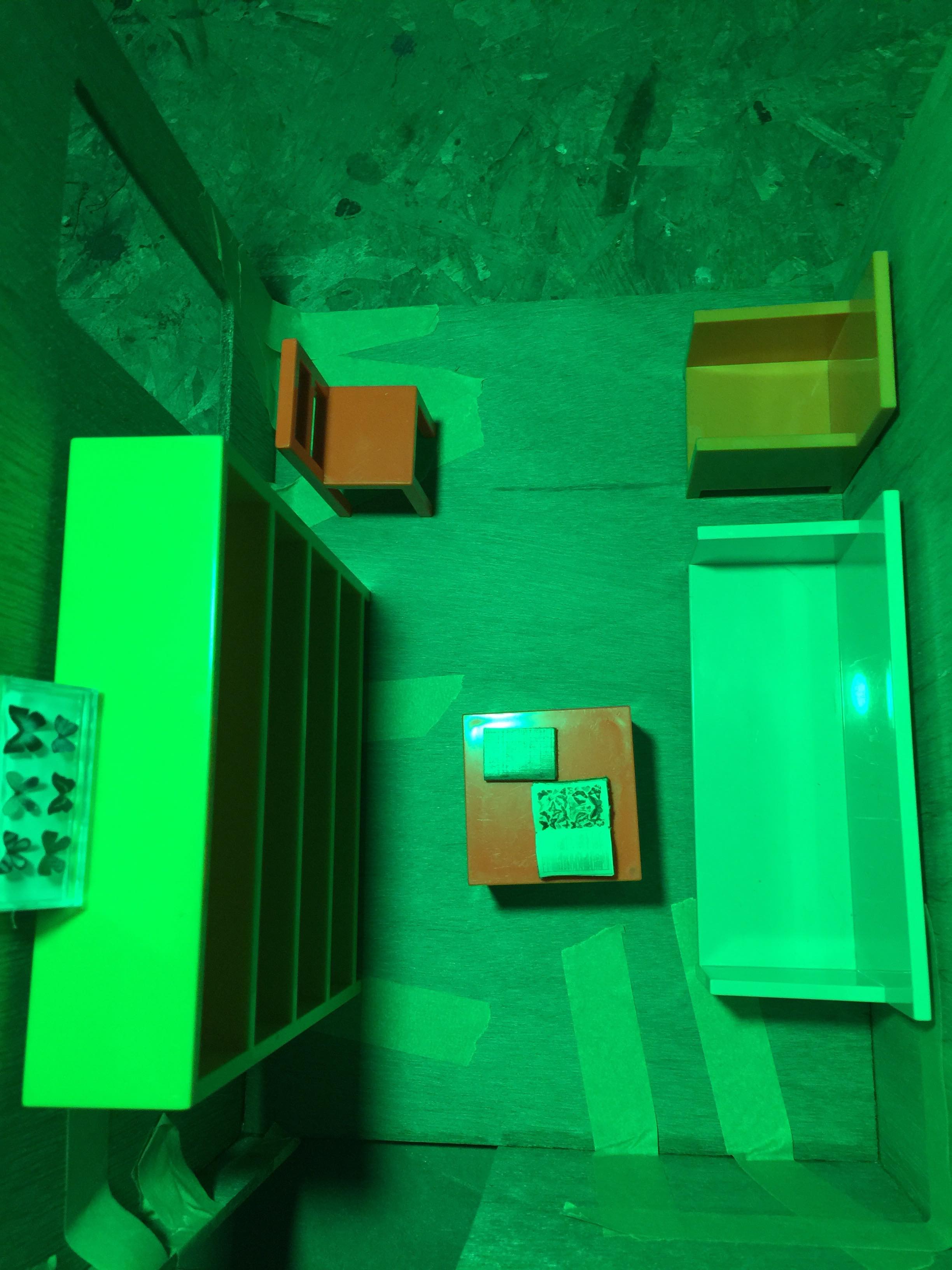
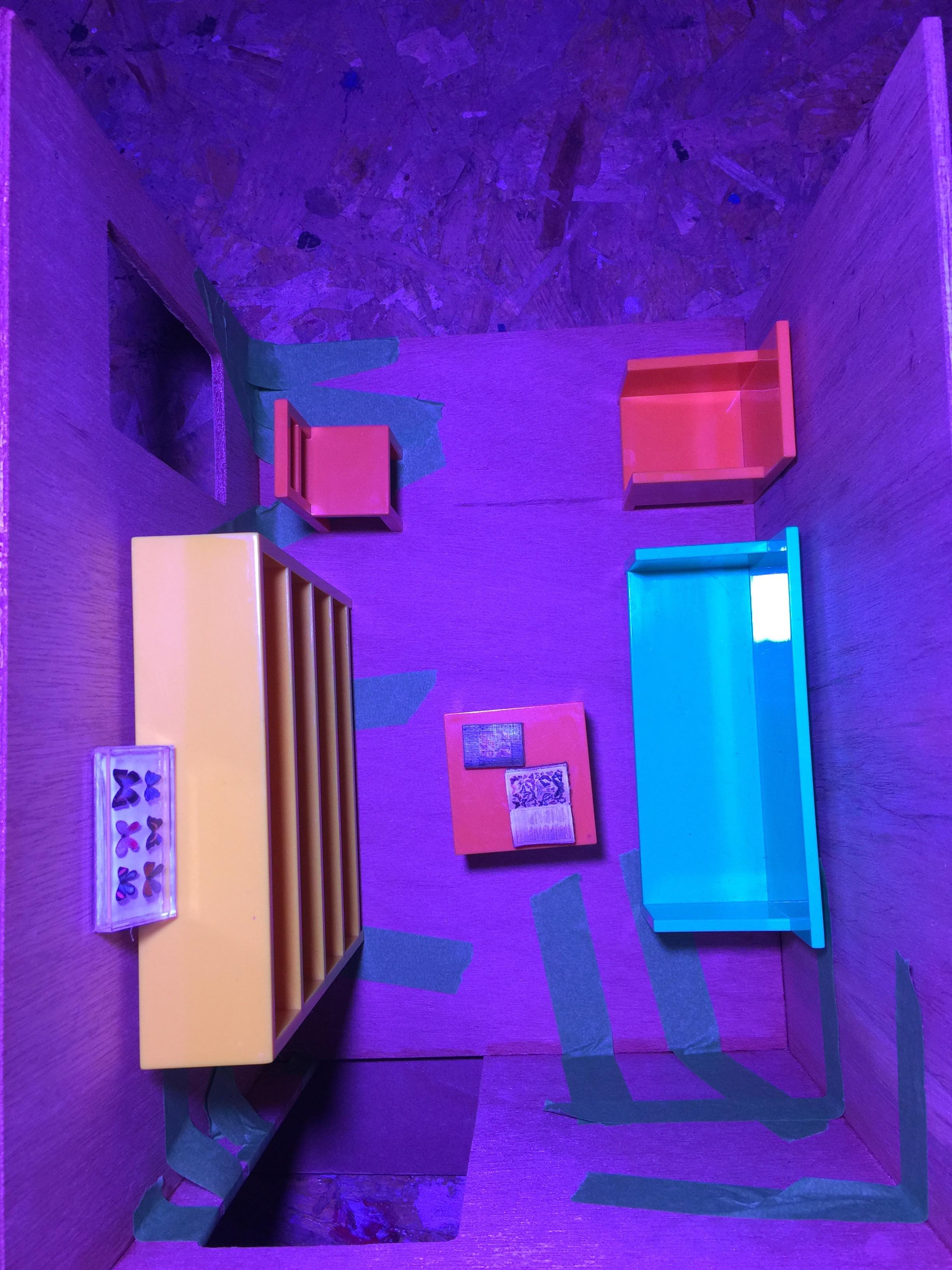
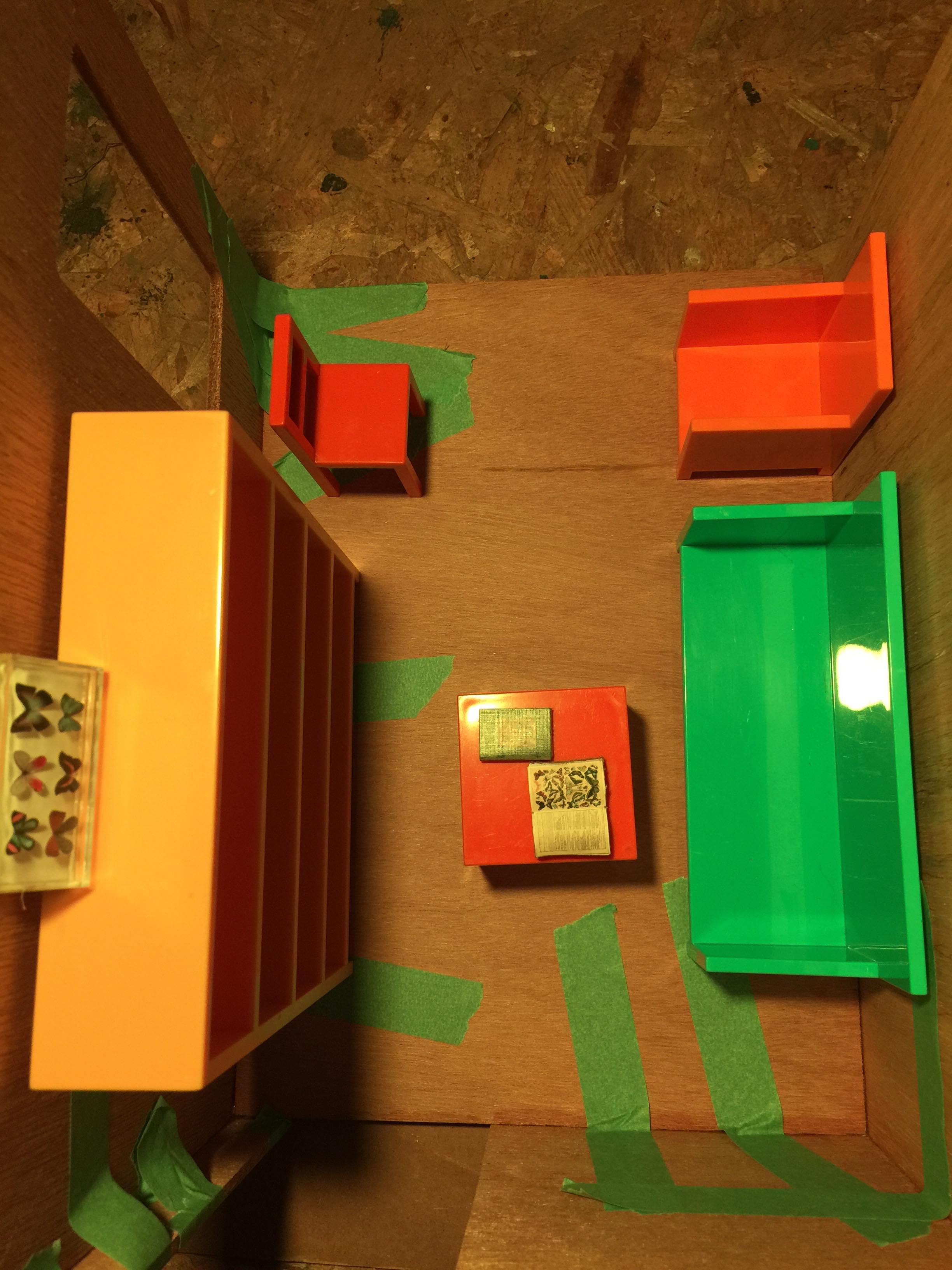
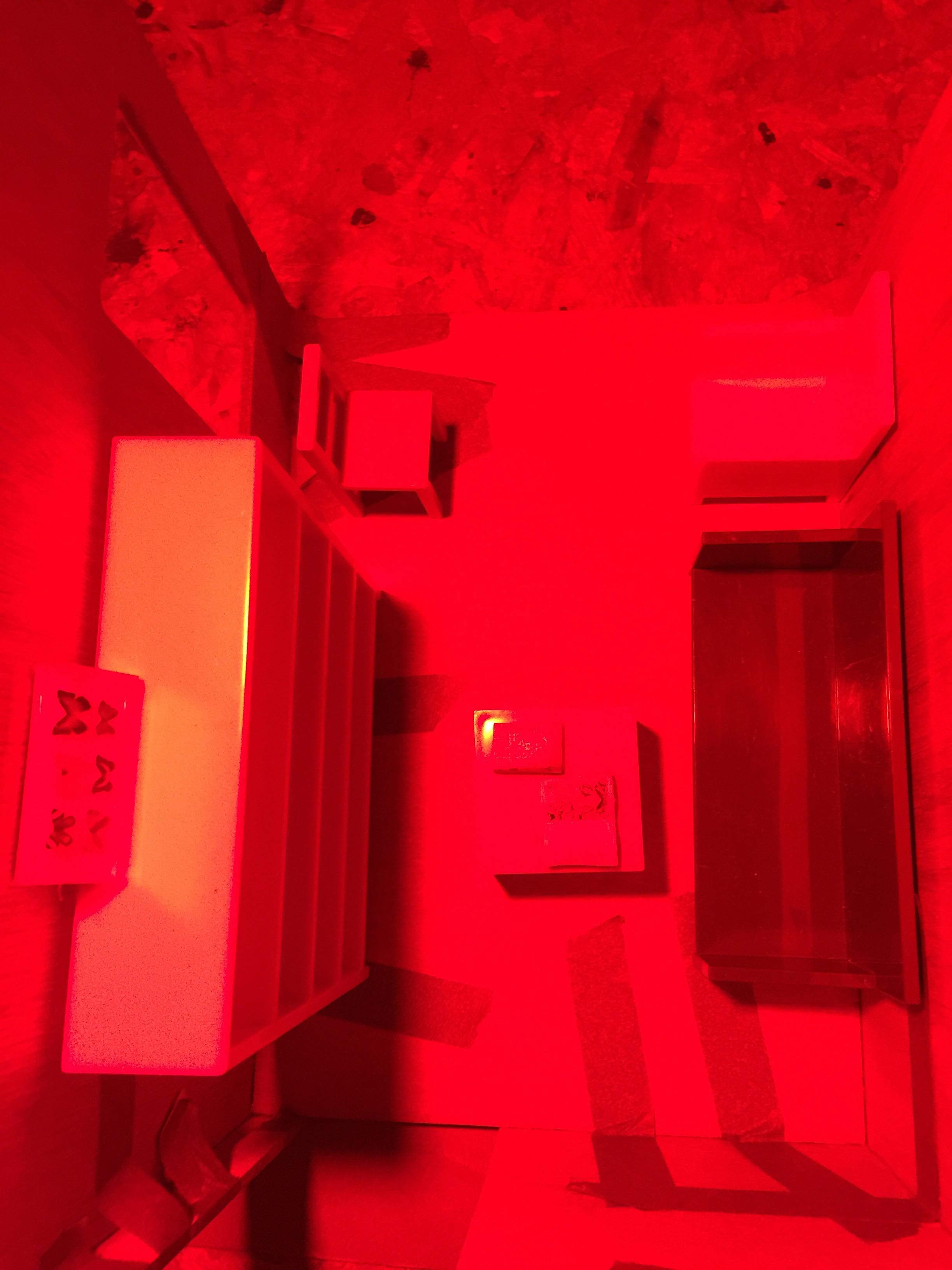
So now I am thinking of making a prototype for a hypothetical art piece in ONE room, with different colored lights changing to light the room.

There will also be a miniature library of science books, and an open book about butterflies, and one about nature, and different colors of furniture. The different colors of light in the room will be really apparent by how they change the perceived colors of objects in the room. Instead of buying Dichroic filters, which Eric Rosenthal told me about (I would like to try those at some point), I will use colored gels to simulate isolating certain color at certain wavelengths. I am thinking James Turrell meets Laurie Simmons type diorama with lighting. I also just saw this artist’s work on Instagram and am very intrigued by this style, it is kind of similar to what I am thinking about for the prototype, though maybe more zoomed out, showing colored light inside from the outsides of buildings.

The general idea is to encourage questioning of perception of color, the “real” color of things, and mindfulness of your surroundings. Maybe this is too obvious? But I think there could be a way to show that in a way that makes you see it from another angle? I still need help with the message, but am closing in on an initial form.

2. A concise project research question(s) and plan for discovery (i.e., which papers/books, which interview subjects, and what forms of experimentation)

Some Books

Also some clinical trials which are listed in my research post below.


2. Who will engage with your project: how, where, and why?

It would ideally be a public installation for anyone, probably in a city though, or an outdoor art space in a place that is frequented by many people (such as a public garden), maybe during the winter temporarily with heating. It could be a place to get warm and read/do research in a very public place. Perhaps it would be somewhere where people are often moving through very frequently and quickly, like Times Square, or outside of a subway station. Probably one wall would be transparent so that others outside can see you inside.

3. What do you want your project to DO?

I want it to encourage people to be more mindful of their surroundings/perception. I haven’t decided if cold light is “bad” for us and warm light is “good” for us or if I would like to frame it that binary way. Instead I would like to just point out different modes of perception of color and space as a way of drawing attention in general to our surroundings, and to how color and light affects our perception and perhaps also our psychology, most often subconsciously, by highlighting it very obviously. As for a call for action, I’m not sure. Maybe the participant would choose their lighting differently in their home or working space.

Plan your remaining 4 weeks and schedule it

This week: I ideated on the final form it will take and acquired materials for building the maquette of this hypothetical installation. It will be a little room with (at least) two different lights shining into it at changing intervals, yellow to blue to follow the warm/cold light theme, or cycling through colors.

Next week: Assemble maquette. Figure out lighting.

Following week: Create a presentation to go with the maquette to describe my process and the “why.”

Q: Have you interviewed your experts? Transcribed the interview yet?

I have interviewed two artists working in public art, Julia Vogl and Graham Coreil-Allen, and took extensive notes. I also recorded and have transcribed an interview with Eric Rosenthal on color perception. I also spoke with Tom Igoe on the technicalities of lighting technology but did not record it, however he recommended that I read a few books, and I took notes. I did not hear back re: neuroscience and art but have downloaded some books on the subject (which are shown above.) I am continuing to look at clinical trials on warm and cold/blue lighting.

Prototype - Stage 2

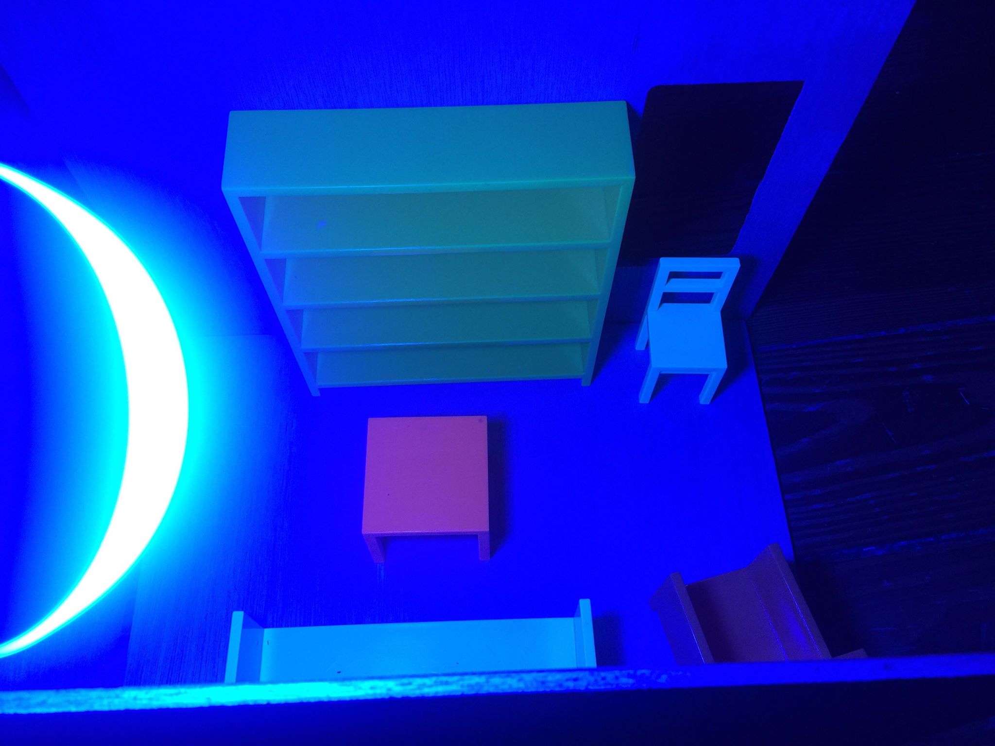
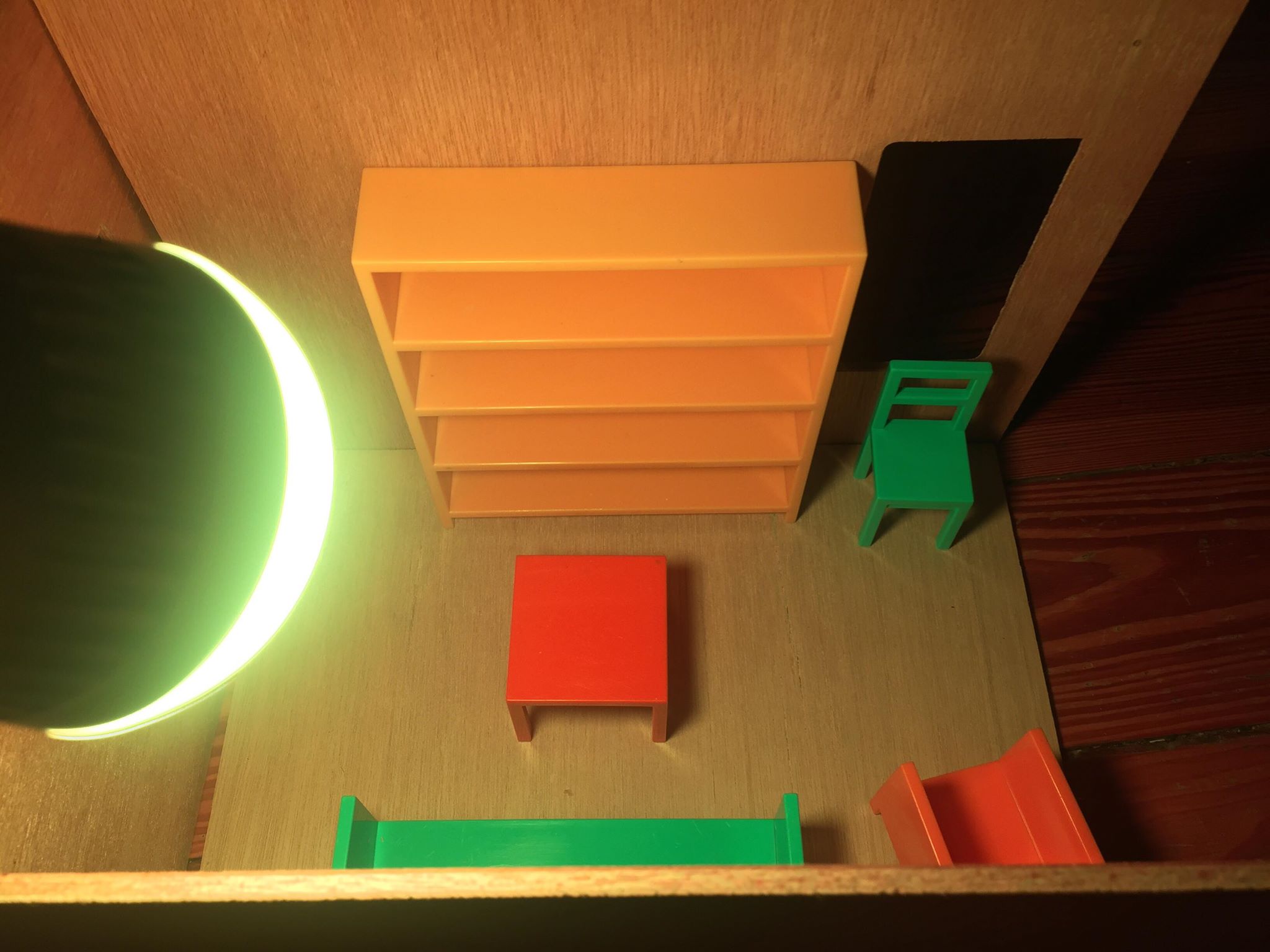
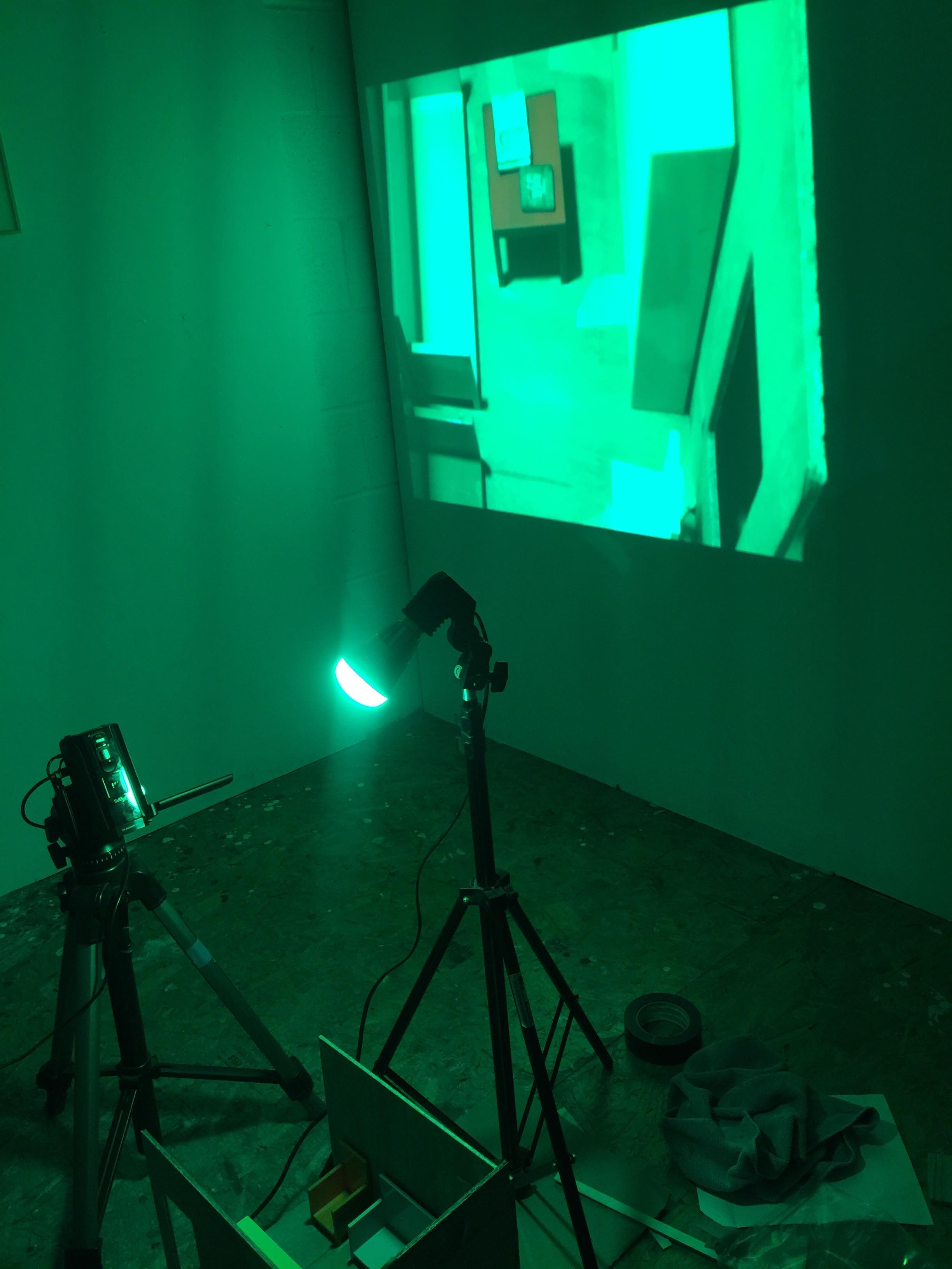
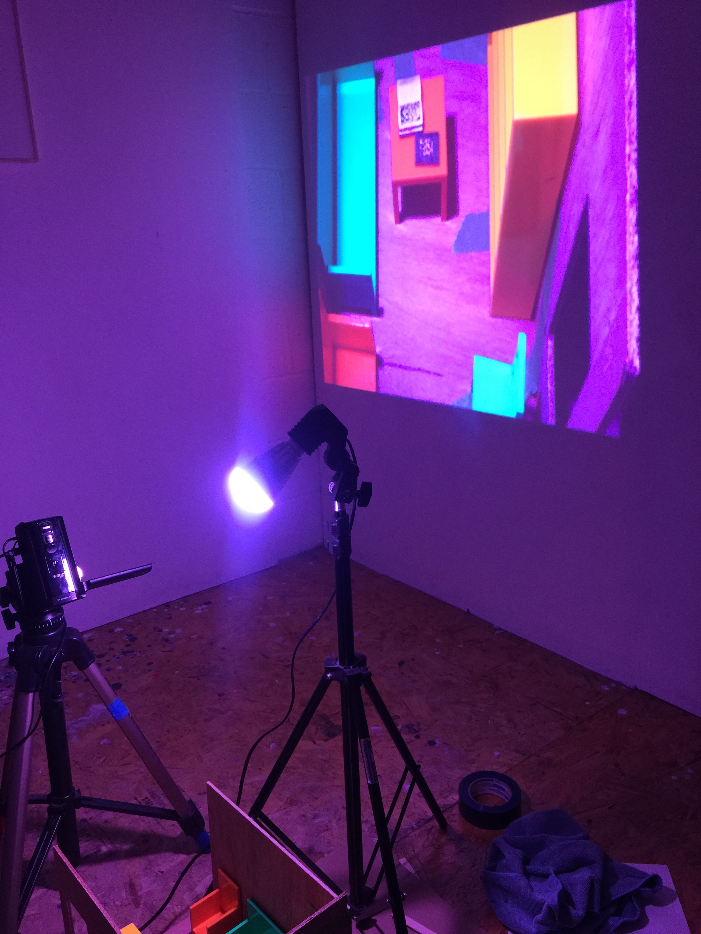
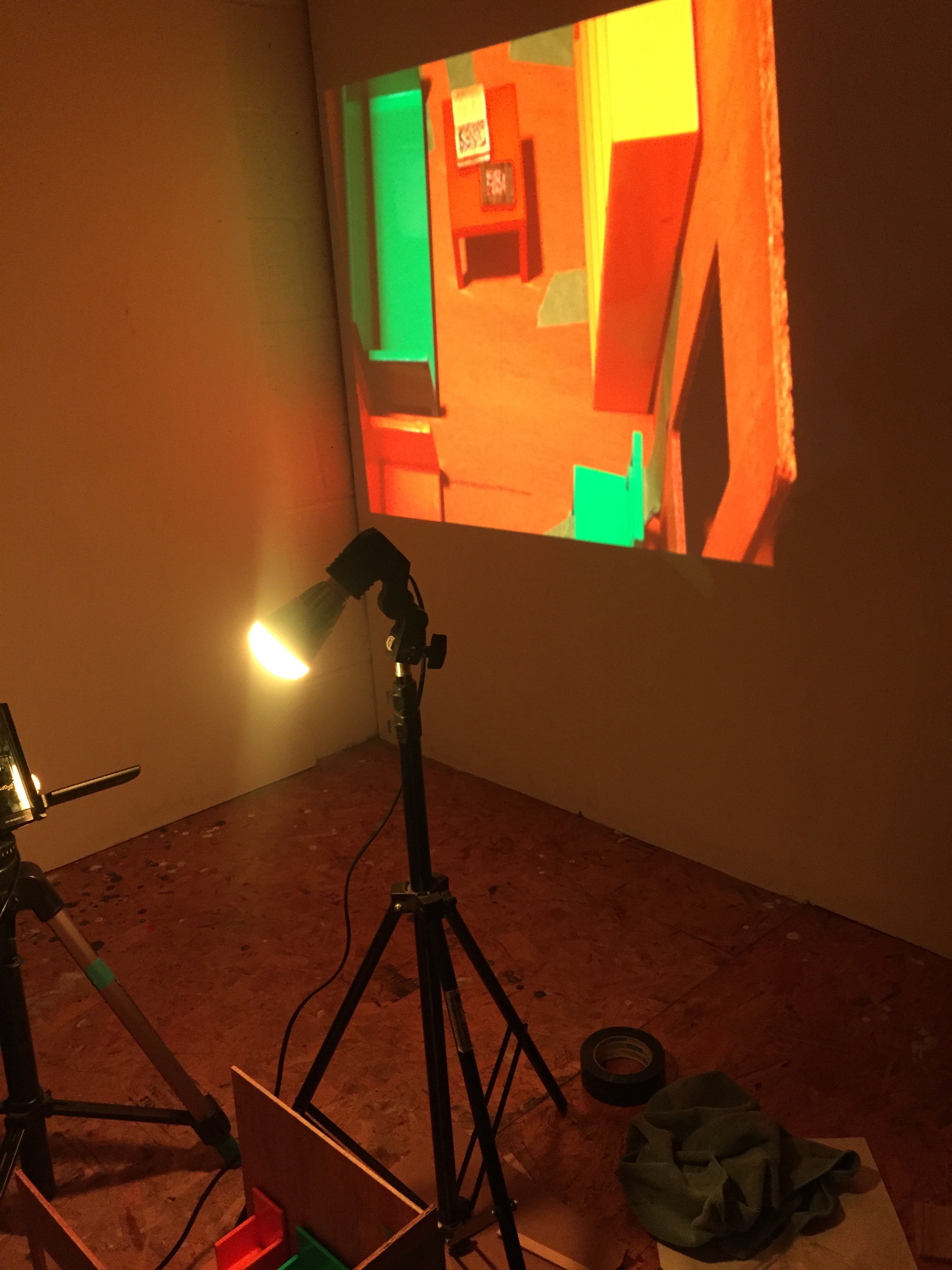
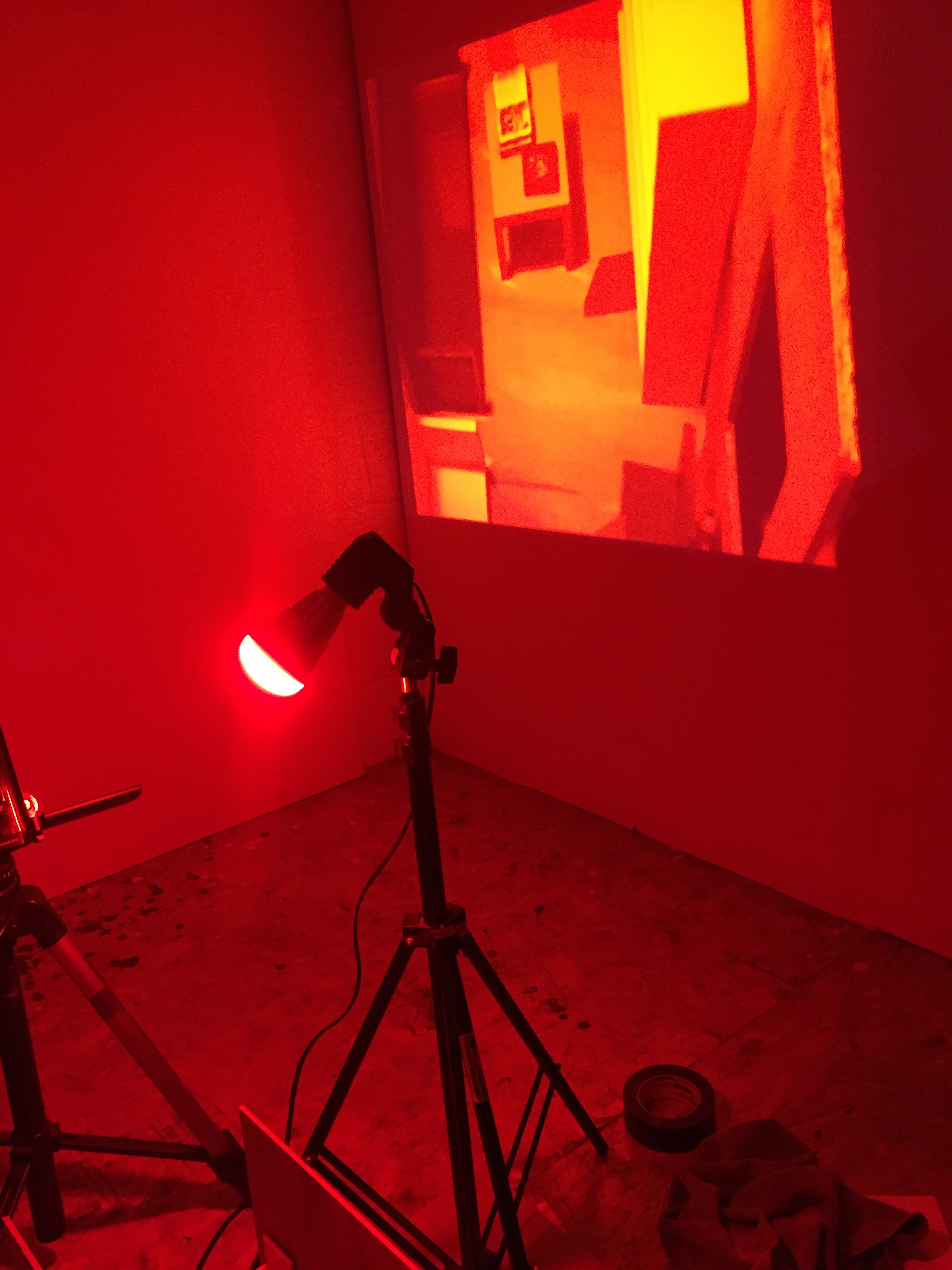
These images are missing the details which will come later…such as the science books, etc, perhaps a figure representing a human, and the pieces being fully assembled/glued, and the light mounted somehow or hung on a stand (or, possibly, LED.) Another option like I mentioned before is to use colored gels and just have regular white lights shining through them. But the bare colored bulb suspended above somehow does the trick and perhaps is most direct.

Update 11/29:

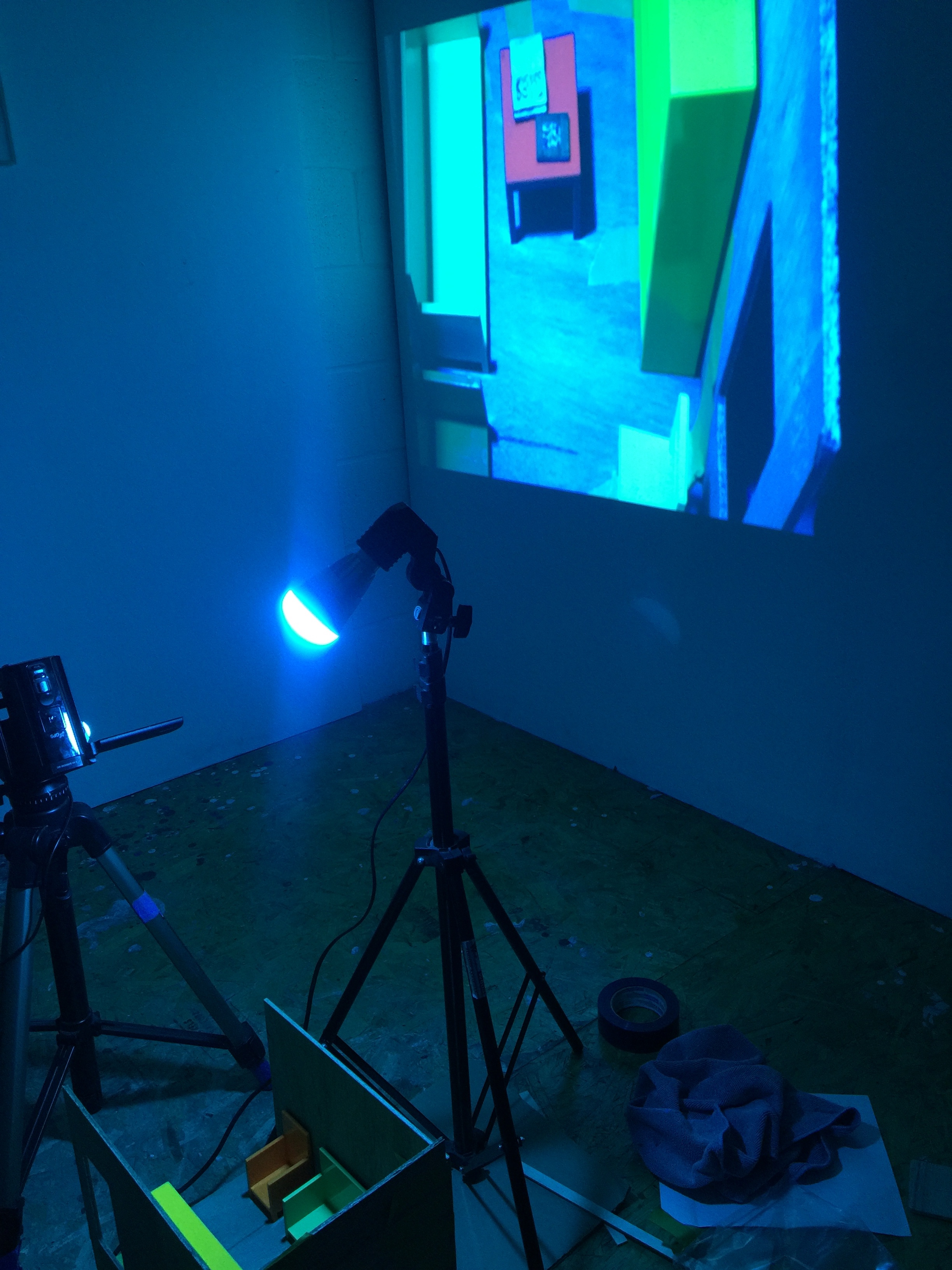
These are photos of the expanded installation with a blow-up/projection of the miniature room on the wall behind it. The color variation is even more pronounced in the digital video, which I learned (from my chat with Eric Rosenthal) is also created in the opposite way of how we see (each pixel has 2 greens, 1 red and 1 blue.) So my point is actually highlighted further in the digital image, which could make the project also address how color in digital imagery is off even further than objects under light in reality. I need help tying this all together for TEx, so it will be helpful to meet with a feedback group today.


Day 425 @ ITP: The Temporary Expert

Addressing my “publics” who are:

  • People who use public transportation daily

  • Office workers or people who work indoors

  • Hospital patients

  • Highly sensitive people

  • People who can’t be out in the sun in the winter

  • People who aren’t outside for most of the day in any weather

My medium so far is a pair of posters that could be hung up in a lobby of an office building or in place of advertisements on subway platforms.

lightposter1.jpg
lightposter2.jpg

Questions: Are they too didactic? How to call people to action without seeming didactic? Is it better to ask questions rather than “give answers”? Should I take a more speculative or fictional approach, and how.

How can my research inform ways to instill this message from a science-based perspective/idea but without words (except for perhaps a well-placed title)?

Day 415 @ ITP: The Temporary Expert

Daily Practice for Seven Days

For this I decided to radiate myself with different colors of light every day for five minutes with two different kinds of light, or at least two different colors. The non-changing factor would be that I will be listening to Psychologically Ultimate Seashore with earbuds on my phone. I will also be sitting in a normal fashion and fully clothed except for my face and hands/arms exposed.

Day 1)
10/24/2018

Gels on lamp

44866126_322097855256949_5427663949933838336_n.jpg
Color gels in the Dinshah chromatherapy set.

Color gels in the Dinshah chromatherapy set.

44951197_480954425748624_8335637090301640704_n.jpg

I did this first experiment in my studio with a 200W bulb and two gels from the Dinshah gel set. According to Dinshah’s system a few of them are meant to be layered in specific combinations to produce certain wavelengths. For this however I decided to play with randomness based on feedback I got during our brainstorming, so I wouldn’t start by being biased towards feeling one way or another and experiment purely with color and different light sources without having a specific healing purpose or bias as a jumping off point.

I blindfolded myself and shuffled through the gels like a deck of cards, choosing one at random. I then put it in the gel holder in front of the light source and sat facing it for five minutes. Before starting each of two random colors I logged my mood and energy level, on a Y axis of calm <—> nervous and an X axis of tired <—> awake.

44939808_2216109275129198_9191357230371307520_n.jpg

The first color I chose at random was one of the two yellow gels, this one more orange-y yellow. From behind my blindfold I could have sworn it was green for some reason. It felt warm (the light was also literally warm) and energizing/comforting.

I was surprised to see it was yellowish-orange, but not totally surprised because of the warmth it exuded, but I still wasn’t sure if the warmth was just from the light itself.

The second color I chose at random felt different. I almost felt uneasy at first. It was not as warm feeling. I saw blue rectangles dancing behind my eyes, then assumed it was probably a blue gel. It was. My mood and energy level did not change from after the first trial to after the second.


Day 2) 10/25/2018

Video color meditations

44939507_285011445475156_3462032756299530240_n.jpg

For the second day I decided to use some color meditations I created over the summer based on the Dinshah color system. I resumed listening to the ocean recording with earbuds. I decided to go with yellow to indigo, to mimic the transition from yesterday.

This time I kept my eyes open. I didn’t see a way to pick at random or a need to anymore. I decided I would rather experiment with different light sources vs one light source, at least for now, to try to get a feel for the differences between them.

The first color, yellow, felt similar to yesterday — not the literal warmth though because it was from my computer screen. I found that my mood changed to be calmer and my energy level went up after five minutes of partially looking at it and partially closing my eyes.

The second color, indigo, also seemed to feel similar to yesterday’s session with the blue gel — I almost felt uneasy at first, it was not totally draining just more cold. . At the end of the second trial I felt about the same as after the first.


Day 3) 10/26/2018

Household lighting

44932809_284713452165739_620259158045753344_n.jpg

For this trial I decided to use two lamps/light sources that I often have as light sources in my home. One was a table lamp with one 53W Incandescent bulb in it, and the other a 90W yellow LED flood light which is more of a mood light.

The first bulb I used was the incandescent bulb filtered through a lampshade. At first it created a red sunlight-like glow behind my eyes, and then it became a bright white. I felt twitchy while sitting in front of it and just wanted it to be over. Afterwards I felt slightly more tired and nervous than before (when I was calm/awake.)

44929537_278039769506665_6681546735371681792_n.jpg

For the second part I used the LED bulb. It was much brighter than the first, almost like sunlight. I mostly closed my eyes. I didn’t mind it. After it was over I felt much more calm and more awake than before I started.


Day 4) 10/27/2018

MindPlace light glasses

First I chose a program at random (#2). I closed my eyes as instructed and saw red and blue lights flickering which over time created a bordering on-analog-VR-like experience. It was almost claustrophobia-inducing, but I was also feeling energized by it.

After five minutes were done I felt more awake than I did before I began, but also more nervous than I did when I began.

For the second round I chose program #21. This one had more green and yellow lights, felt more open and less claustrophobia inducing. It felt more like being washed with rather than bombarded by stimuli. After five minutes were over I felt only slightly more calm, and much more awake.


Day 5) 10/28/2018

Laptop screen VS Laptop screen w/Orange glasses

45008457_1844504938918171_3176242827810045952_n.jpg
Laptop screen through UV blue light blocking glasses.

Laptop screen through UV blue light blocking glasses.

After a day of staring at the screen doing coding homework, I decided to for today’s experiment to test pure laptop light VS laptop light as seen through UV blue light blocking computer glasses.

For the first five minutes I stared directly at a white screen (with the f.lux app on) I did not enjoy looking at it, and I closed my eyes for part of it to avoid staring at it directly. After the trial was over I felt more tired and more nervous than I had before I began.

For the second five minutes I stared at the same blank screen while wearing the UV blocking computer glasses. I enjoyed looking at the orange light and kept my eyes open the whole time. Afterwards I felt more awake and calm than I did before I started.


Day 6) 10/29/2018

Verilux Happylight VS NYC Subway lighting

44986440_183565112555245_2036233373579476992_n.jpg

For the sixth experiment I decided to compare two lights which are similar in that they are artificial but different in their purpose and in the intention for their use. The HappyLight on the one hand is meant to charge and focus the users’ energy; it is marketed as an “energy lamp.” On the other hand, the subway light seems to be purely practical in its intention and usage. I’ve always suspected these bare fluorescent bulbs were harmful to our health.

For the first five minutes in front of the HappyLight, I felt comfortable — I looked at it partially and closed my eyes partially. I liked it. I felt the light in my core, somewhere in the chest area. Afterwards, I felt more calm and more awake than I did before I started.

45122608_250387095825686_7699781445715230720_n.jpg

After five minutes under the subway lighting, I felt dull. I didn’t enjoy it. Given, I was waiting for the train. When five minutes were up, I felt around as calm as before, and more tired.


Day 7) 10/30/2018

Last day: Daylight.

IMG_9154.jpg
A processed photo revealing rainbow light from the sun??

A processed photo revealing rainbow light from the sun??

Today I just did one trial, with natural sunlight. It seemed like a natural place to end up. I realize there were also other factors at play, but this one was by far the most effective of them all. I felt the most literal warmth, and a warm, orange-yellow light.

This obviously is more light and heat than any one lamp could produce. There were also the other sensory factors like breeze and temperature and ambient sounds. After five minutes I felt much more calm and slightly more awake than before.

During our discussion today in class after I did this last sitting, I was helped to realize that all my trials up until today were done inside. Natural daylight so far was by far the most successful of all of my “trials” so far. We also talked about the need for S.A.D. lamps in the winter when it is more difficult to have time outside in the sun.

This led me to think focusing on some speculative sculpture or public art piece that is proposed to be done in the winter could be fitting for this, when it is harder to be outside in daylight. Also in places where it is not possible to actually go outside very often, what could be done to improve the lighting in those situations for overall health.

My research consultation with Margaret at the library pointed me to many clinical trials on PubMED about the specific effects of blue light on humans.

Working with yellow/orange light as a counterpoint to blue light would be something interesting I think for me to work with design wise from a scientific/psychological standpoint.

Day 413 @ ITP: The Temporary Expert

Final Project Research

PUBLIC ART & COLOR/LIGHT STUDIES


Hypothesis

Public lighting isn’t doing much for us as it is. This is because most wavelengths of widely used light sources in public spaces (such as fluorescent bulbs) emit harmful wavelengths that are damaging to our physical wellbeing. This also is true in most offices and workspaces, where you can do little to control your environment.


Method

Some countries around the world are funding public art installations which deal with this issue both directly and indirectly, and I will be researching these as well as interviewing people working in various intersecting fields related to color and light and public art, as well as conducting a series of light trials and interviews.

After doing this I will create at least one speculative design for a public lighting and art installation based on the above research.


Research

I found this (possibly questionable) Dinshah therapy system - I ordered the gels and a light.

Even if he was a quack, and it’s possible he truly believed in color therapy but was never legitimized because the pharmaceutical industry took control of deciding what was or wasn’t legitimate medicine, they are still colors that will provide a strong starting point for practical experiments.

My research will include interviews with others on color and light and their relationship to it, as well interviews with experts in the field on working in public art and with color, and on light/neuroscience.

I be researching the light emitted from bulbs and screens of various kinds and the effects different kinds of light have on humans along with the research on colors, intersecting both together (color & light) where I can, as well as focusing on psychological, neuropsychological, and neurophyaical effects of color and light, and the effects of light radiation on the body/skin.


Brainstorming Analogies

People are like plants; we need full spectrum light from the sun.

Balancing your mood is like mixing light to try to create a full spectrum. If you are missing a color, you will feel “off.”

On top of that, specific wavelengths can be targeted on the electromagnetic spectrum to work on certain imbalances of the energy or body. Just as radio waves are used to send radio signals, infrared waves (which are invisible) and the color red (on the visible spectrum) can be used to target certain areas of your body and heal.

Each wavelength on the electromagnetic spectrum can potentially be used for a purpose, and color is itself a form of radiation that we can put to use in our environments for improved health and mood, which would in turn be beneficial for society. At the very least, we could think about the lighting we currently use more critically, and perhaps integrate color therapy into hospitals, airports, and other public spaces that can induce stress.


Potential Experts

  • Sonja Blum (ITP Professor - The Neuroscience of Color — on light and its neurological effects on the nervous system) (Marina’s rec) (need to e-mail)

  • Yeseul the resident who works with color (Marina’s rec) (need to schedule office hours)

  • Eric Rosenthal (Engineering teacher / Basic Analog Circuits / Computer Vision - on light/color and its radiation/properties) (interviewed on 11/12, recorded it and need to transcribe)

  • Julia Vogl (http://www.juliavogl.com/) - London-based artist working in public light and civic engagement using applications of color and light in temporary and permanent installations (interviewed on 10/29, did not record but took typed notes, will organize notes soon)

  • Graham Coreil-Allen - Baltimore-based artist working in public art/civic engagement (interviewed on Friday 11/2, did not record but took typed notes, will type up notes soon)

  • Light therapy practitioner Samyo Delgarno (http://mfieldtherapy.com/) on the instruments he uses and how the engineer he works with decides to make them (have started talking to him about this)

Non-experts but color enthusiasts/volunteers for interviews/trials

K.B. (interviewed)

K.R. (interviewed)

M.K. (confirmed for interview)


Need to find more scientists, and perhaps Margaret will be able to help.


Papers/articles to find and read/include in my research

  • Olafur Eliasson - papers on the psychology of color in his work)

  • James Turrell - papers on the psychology of color in his work)

  • On psychology of color in different cultures in general

  • On the physiological effects of light

  • On light and color radiation

  • On light and color used in medicine

  • More questions: Does light therapy work on all skin types and colors? How important is this in its efficacy? Is the psychological effect of different colors visually universal, or are there cultural meanings which intercept the pure psychological reaction? What, if anything, about color and light is universal? If nothing, what else can I bring to this project that is universal?


Bibliography

Books
Light: Medicine of the Future: How We Can Use It to Heal Ourselves NOW by Jacob Lieberman

Let There Be Light by Darius Dinshah

Websites/Articles
“The Amazing Psychology of Japanese Train Stations”

Post-Margaret appt:

PubMED (clinical trials)

The effects of low-intensity narrow-band blue-light treatment compared to bright white-light treatment in seasonal affective disorder.

Blocking nocturnal blue light for insomnia: A randomized controlled trial.

Potential for the development of light therapies in mild traumatic brain injury.

Clinical recognition of hypoxaemia under fluorescent lamps.

Acute exposure to blue wavelength light during memory consolidation improves verbal memory performance.

Premenstrual mood and empathy after a single light therapy session.

Randomised controlled trial of the efficacy of a blue-enriched light intervention to improve alertness and performance in night shift workers.

Blue-Enriched Lighting for Older People Living in Care Homes: Effect on Activity, Actigraphic Sleep, Mood and Alertness.

Effect of exposure to short-wavelength light on susceptibility to motion sickness.

Effect of blue-blocking glasses in major depressive disorder with sleep onset insomnia: A randomized, double-blind, placebo-controlled study.

The effects of spectral tuning of evening ambient light on melatonin suppression, alertness and sleep.

Blue-Light Filtering Spectacle Lenses: Optical and Clinical Performances.

Effects of smartphone use with and without blue light at night in healthy adults: A randomized, double-blind, cross-over, placebo-controlled comparison.

Reading from an iPad or from a book in bed: the impact on human sleep. A randomized controlled crossover trial.

Exposure to Blue Light Increases Subsequent Functional Activation of the Prefrontal Cortex During Performance of a Working Memory Task.

Blue-blocking glasses as additive treatment for mania: a randomized placebo-controlled trial.

Effect of phototherapy with turquoise vs. blue LED light of equal irradiance in jaundiced neonates.

Afternoon nap and bright light exposure improve cognitive flexibility post lunch.

Sleep and circadian rhythms in hospitalized patients with decompensated cirrhosis: effect of light therapy.

Effects of a chronic reduction of short-wavelength light input on melatonin and sleep patterns in humans: evidence for adaptation.

Effects of blue light and caffeine on mood.

Randomized controlled trial of light therapy for fatigue following traumatic brain injury.

In-car nocturnal blue light exposure improves motorway driving: a randomized controlled trial.

The color red reduces snack food and soft drink intake.

Light therapy for seniors in long term care.

Effects of changes in colored light on brain and calf muscle blood concentration and oxygenation.

Low-intensity blue-enriched white light (750 lux) and standard bright light (10,000 lux) are equally effective in treating SAD. A randomized controlled study.

Bright light treatment in elderly patients with nonseasonal major depressive disorder: a randomized placebo-controlled trial.

Impact of blue vs red light on retinal response of patients with seasonal affective disorder and healthy controls.

Qualitative analysis of therapeutic light effects on global function in Alzheimer's disease.

Amber lenses to block blue light and improve sleep: a randomized trial.

Patterns of depressive symptom remission during the treatment of seasonal affective disorder with cognitive-behavioral therapy or light therapy.

Low-intensity LED therapy (658 nm) on burn healing: a series of cases.

Randomized, blinded, controlled trial on effectiveness of photobiomodulation therapy and exercise training in the fibromyalgia treatment.

Clinical efficacy, onset time and safety of bright light therapy in acute bipolar depression as an adjunctive therapy: A randomized controlled trial.

Evaluation of a randomized controlled trial on the effect on return to work with coaching combined with light therapy and pulsed electromagnetic field therapy for workers with work-related chronic stress.

Light therapy for multiple sclerosis-associated fatigue: Study protocol for a randomized controlled trial.

Dopamine and light: effects on facial emotion recognition.

Google

Blue Light May Help Alzheimer’s Patients


Interviews

  1. K.B.
    - Based on past experiences they do not like fluorescent lighting or having to work in it for long periods of time and prefers natural light if possible, or low lighting indoors.
    - In terms of colors they are attracted to red/orange/yellow.


Misc. Questions

1. Color (Light) and Sound

Does sound help to supplement color therapy? How can it complement colors across the electromagnetic spectrum? Are the sounds that are most similar to their corresponding color over the spectrum related in their healing properties?

This theory is different than the one based on energy centers in the body (or chakras) but more based on math across the electromagnetic spectrum.


2. Light/Color and Public Art

Where in the world is this being implemented already? What publicly funded artwork (and lighting) is playing with these ideas, even if it’s not directly with the color healing relationships to the body? How does public art affect those who see it? What semi-public art is doing similar things (in publicly accessible, paid-entry locations)? Try to find reviews, reactions to these installations.

1000 Opinions by Julia Vogl This hyperbolic bar chart and colour field painting reflect the public's opinion of where they would allocate a spare million of public spending. I surveyed 1000 people throughout London, a 100 people in 10 different comm…

1000 Opinions by Julia Vogl This hyperbolic bar chart and colour field painting reflect the public's opinion of where they would allocate a spare million of public spending. I surveyed 1000 people throughout London, a 100 people in 10 different communities, asking them to select one area from the London Greater Authority Budget list. The options were: ARTS & CULTURE (hot pink) BUSINESS & ECONOMY (gray) HEALTH ( seafoam green) HOUSING ( sky blue) EDUCATION ( royal blue) ENVIRONMENT ( turquoise) SAFETY & POLICING ( yellow) SPORTS & OLYMPICS ( orange) TRANSPORTATION ( red). I then made a steel mechanism that with the banners functioned as massive roller blinds. Each day of the show the banners were lowered or raised to reflect a different communities results.

http://www.juliavogl.com/portfolio/public-works/1000-opinions/

Sun-Stomp-perspective-NW.jpg
Sun Stomp Premiering at the 2018&nbsp;Light City&nbsp;Baltimore festival,&nbsp;Sun Stomp&nbsp;was a solar powered light and interactive audio-visual environment that for eight nights activated McKeldin Square. The monumental scaffolding sculpture fe…

Sun Stomp

Premiering at the 2018 Light City Baltimore festival, Sun Stomp was a solar powered light and interactive audio-visual environment that for eight nights activated McKeldin Square. The monumental scaffolding sculpture featured an interactive projection on one side and an array of sixteen 290 watt solar panels on the other. Electrical energy collected during the day and was stored as chemical energy in a battery bank which provided electricity to a colorful array of LED neon lights illuminating the structure after dark. Participants were invited to stomp on the bleacher footboards to trigger sun-inspired visuals and amplified sounds of the Sun sourced from NASA’s Solar Dynamics Observatory. Passersby were also invited to peer into the custom built “Power Shed” to learn about the solar technology and AV controls energizing the project. Foot-stomping powers combined, participants visually and experientially conjured the awesome and beautiful power of the sun.

https://grahamprojects.com/projects/sunstomp/

Choose your own Adventure transformed Baltimore’s Charles Street Bridge into a colorful playscape of pedestrian pathways and hanging beach balls. The project was commissioned by Baltimore Office of Promotion and the Arts for the free 2018 Artscape f…

Choose your own Adventure transformed Baltimore’s Charles Street Bridge into a colorful playscape of pedestrian pathways and hanging beach balls. The project was commissioned by Baltimore Office of Promotion and the Arts for the free 2018 Artscape festival. Spray chalk lines marked a site-based map converging under a forest of beach balls hanging from an open air structure. The streetscape-enhancing project was a collaboration between Baltimore-based public artists Becky Borlan and Graham Coreil-Allen.

Choose your own Adventure took inspiration from the natural paths taken by street-crossing pedestrians, the Jones Falls and train tracks below, and the joyful experiences of summer-inspired toys. Hundreds of thousands of festival goers interacted with the kinetic environment of over four hundred colorful, translucent beach balls and a line striping street mural covering over three thousand square feet. Numerous beach balls featured hand-painted instructions offering choices for adventures beyond. Adventures included “Write a Poem in the Dirt”, “Change your name for the summer,” and “Take the first train to the end of the line.” Through tactical urbanism and creative design, the installation previewed possibilities for completely transforming the Charles Street Bridge into a playful, poetic, and pedestrian environment.

https://grahamprojects.com/projects/adventure-artscape/

“Georgetown will light up this winter with nine public art installations” (2017) https://dc.curbed.com/2017/11/27/16686450/georgetown-glow-artists-2017

Georgetown will light up this winter with nine public art installations” (2017) https://dc.curbed.com/2017/11/27/16686450/georgetown-glow-artists-2017

Longwood Gardens “Nightscape” - Set over Longwood Gardens' expansive grounds in Kennett Square, PA, Nightscape combines the projection mapping technology of Klip Collective with the sounds of Sun Airway, Pink Skull and more, and leads guests on an immersive and imaginative nighttime journey. Over two seasons, Nightscape has attracted nearly 300,000 visitors.

Nightscape: A Light And Sound Experience Returns To Longwood Gardens On August 3 (2016) https://www.uwishunu.com/2016/07/coming-attraction-nightscape-light-sound-experience-klip-collective-returns-longwood-gardens-august-3/

3. Color and Food

Does the food we eat affect our mood similarly to how colored light affects our mood? What does the color of food tell us? What does it not tell us? Not sure yet if this will make it into the final project or not, but it is of interest.

Does the food we eat affect our mood similarly to how colored light affects our mood? What does the color of food tell us? What does it not tell us? Not sure yet if this will make it into the final project or not, but it is of interest.


Lo-fi Prototypes

warmlight.jpg
coollight.jpg
 

Further Research

My Pinterest on light art has been started here.

Day 408 @ ITP: The Temporary Expert

Solar Energy Calendar (A Field Guide)


All 12 months

IMG_8641.jpg
IMG_8633.jpg
IMG_8631.jpg
IMG_8639.jpg


Solar Energy Calendar & Field Guide - Further Afield…

Many thanks to Matt Weaver, Alex Nathanson, Jay Babcock, Evie Elman, and Marina Zurkow for their advice in the making of this project.

Related projects and links:

Solar Power For Artists
www.solarpowerforartists.com

E-Foraging
www.eforaging.com

Sun Stomp
landartgenerator.org/blagi/archives/5882
facebook.com/sunstomp/


Video
Saul Griffith: “Infrastructure and Climate Change”

Petition (in under a minute!)
>> SEND A LETTER TO YOUR LOCAL PAPER FOR NYC SOLAR <<


REFLECTION

While finalizing this project my goal was to iterate on it and not just create a glorified first draft.

With this goal in mind along the way I really valued and needed all the input and reactions I could find from experts and non-experts alike. I tried to combine it all as best I could to transform the project into something more evolved from the first and second drafts.

That being said, I think it’s still not 100% done, especially now that I look back on it a few days later.

I would be open to iterating the project further, especially if I were to actually disseminate it out into the greater world somehow or give them as gifts to friends and family (seeds and all) which I think I might like to do. For one, I would make the calendar part take up half the page or as much as the image/text so that is more usable, and I am open to any other suggestions or feedback on how it could improve.

I also was inspired in working on this by how reaching out to specialists could bring more meaning to my projects.

Continued:

After I made this I went up to Storm King sculpture park to see their exhibition “Indicators: Artists on Climate Change” which was very moving, and I felt even further inspired by how one could make impactful art about climate change. People sometimes joke about how making art about real-life political issues doesn’t do anything, I honestly don’t believe that. I believe anything that moves people on a level beyond logic is valuable, especially if logic is also still in the mix there somewhere or meaning. For example, Maya Lin’s piece “The Secret Life of Grasses” showing how far plant root systems can go down and suck up carbon was educational. In particular the project “Dear Climate” by the artist collective General Assembly was conveying some of the sentiments I was trying to get at with my calendar but on a broader scale where they were addressing climate change and human impact on the environment and not just the use of renewable energy. (Update 10/25: Marina, I just realized you are also behind this!!! I had a feeling!!! Did you tell us about this already? It makes sense and now I am embarrassed)

I found myself also looking up other projects in this vein afterwards, and ending up finding this project by Dorinth Doherty on the Svalbard seed bank in Norway. The connections are endless, and I think artists working with scientists is an a goldmine for finding more and more connections.

Day 391 @ ITP: The Temporary Expert

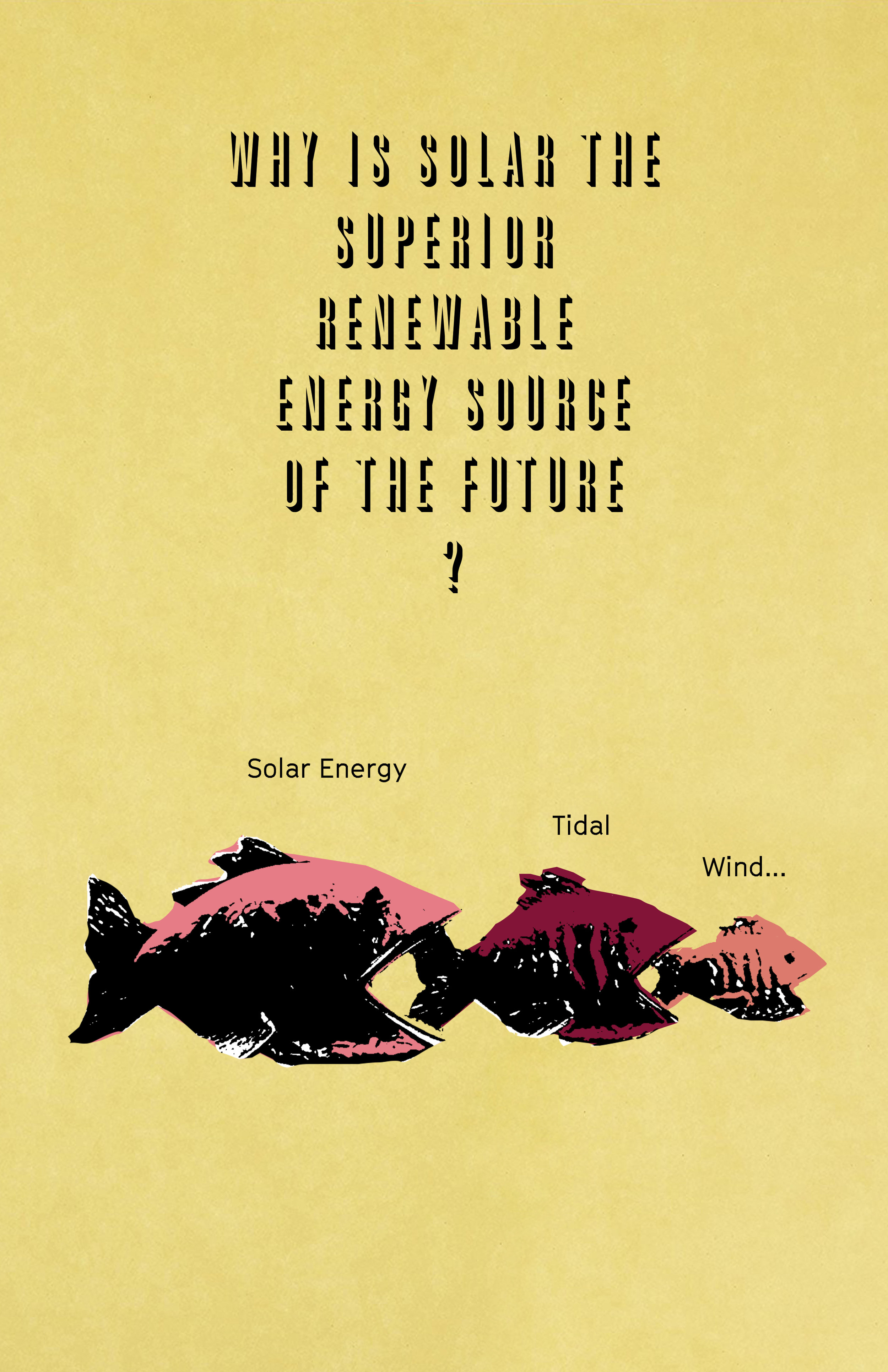
Solar Zine Final Draft — V1

Some helpful feedback from our user testing in class:

- Print them all on seeded paper, with the suggestion to pass along or plant each one after reading.
- Make them all into postcards or calendars to think about time and the sun in that way?
- Maybe include a poster of just one of them?
- Change the font (all of it, and at very least the denser parts) to be more readable. I had already gotten this feedback but forged ahead and forgot/was too concerned with the content to stop and fix it. Maybe play with the idea of a shadow moving across the arc of it to keep it in some order sequentially, and think more about the final order if there is one, or decide that they can be shuffled if not.
- Possibly simplify the text: less words, one message per sheet.

The final version due October 16th, and I will post images of the printed version when it is done.